Cut The Crap And Get To The Point — Anthony Burrill
We delve into the elemental world of legendary graphic artist Anthony Burrill. As he deconstructs his craft, we talk about his memories of Mumbai, his tryst with design and the words that inspire his riveting posters.
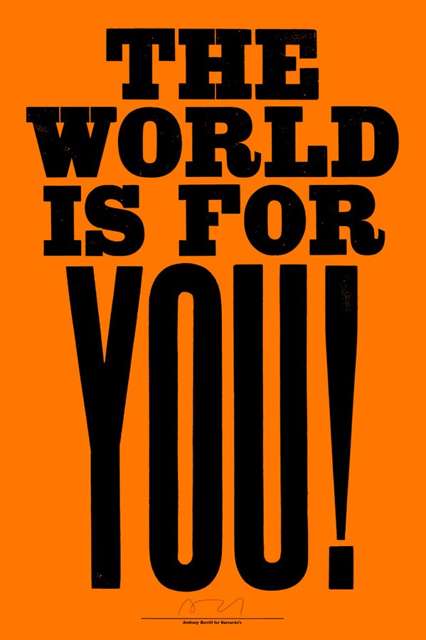
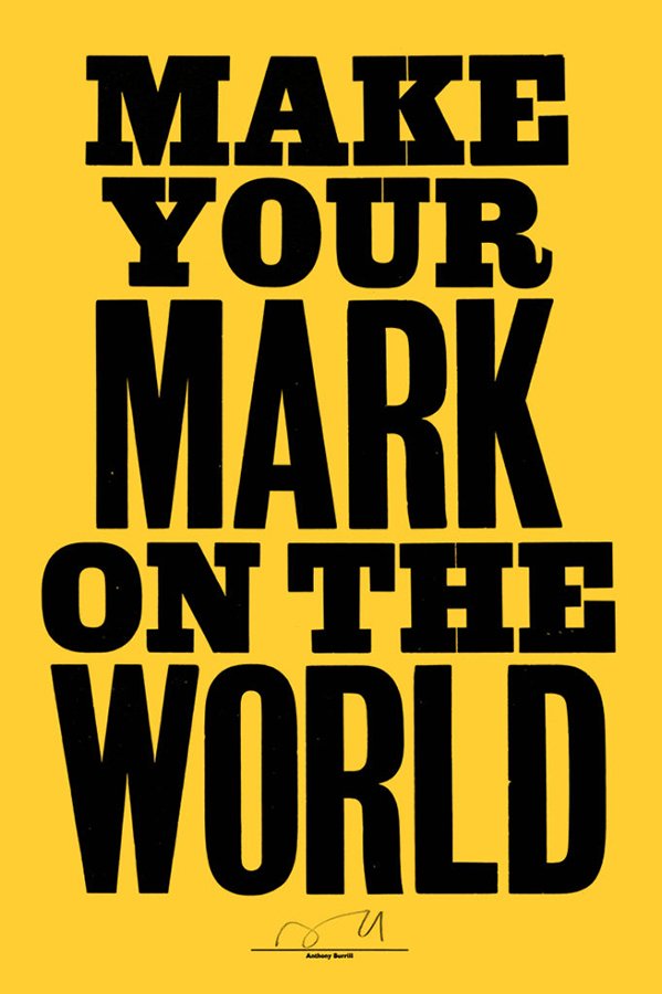
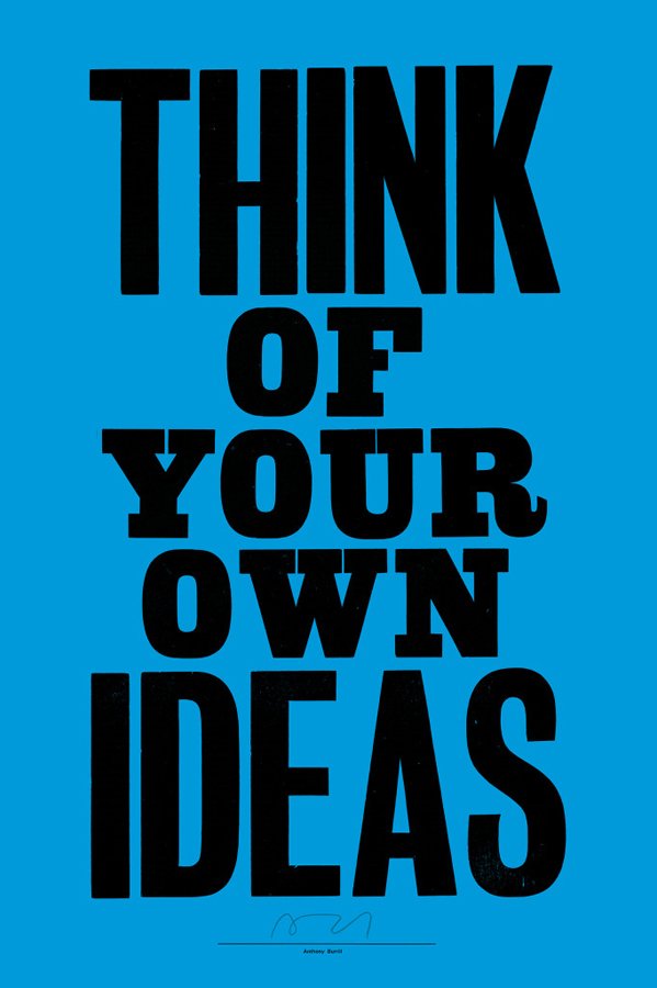
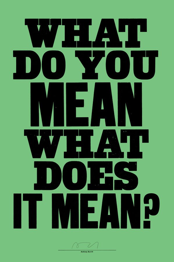
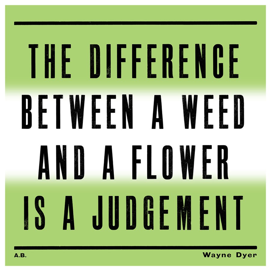
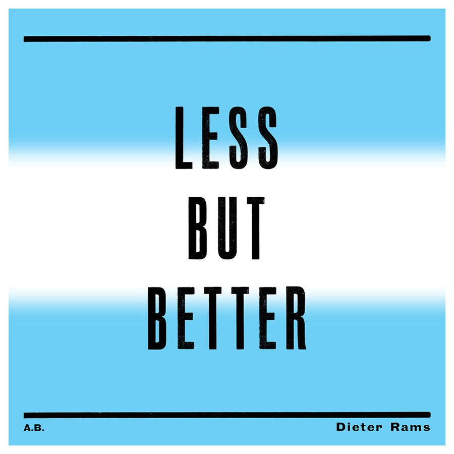
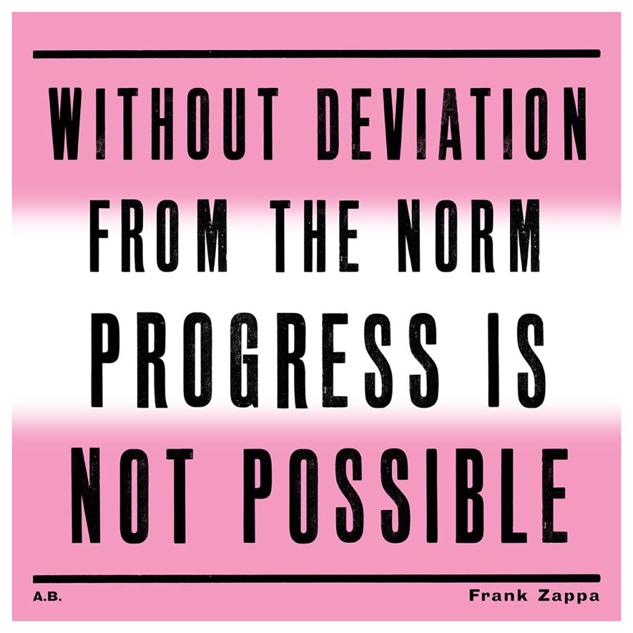
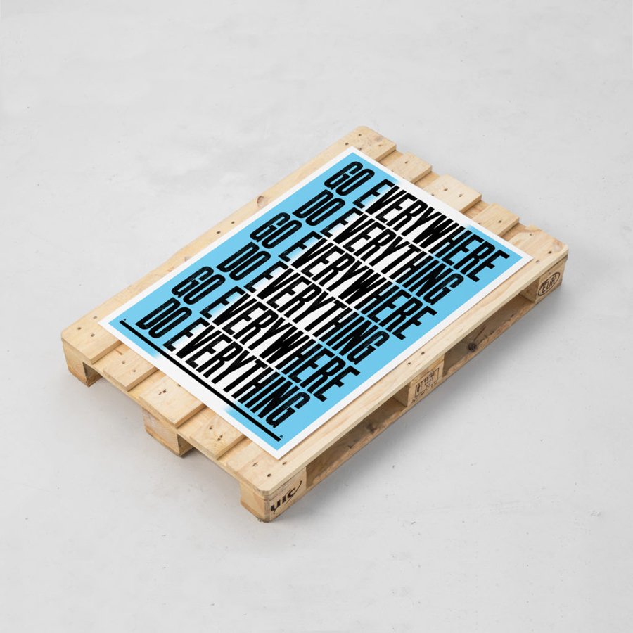
If brevity is the soul of wit, graphic designer Anthony Burrill is the wittiest man in the room. His gripping and often ironic posters are at once minimal yet striking, featuring basic compositions, primary colours and elemental shapes. Perhaps, what makes his work so engaging is the sheer simplicity of it. For Anthony, less is more, as he tackles every brief and deconstructs the visual, keeping only the essential.
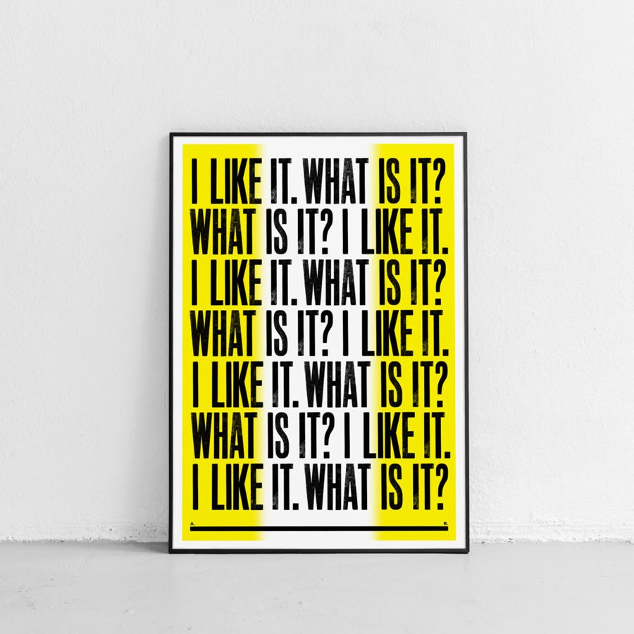
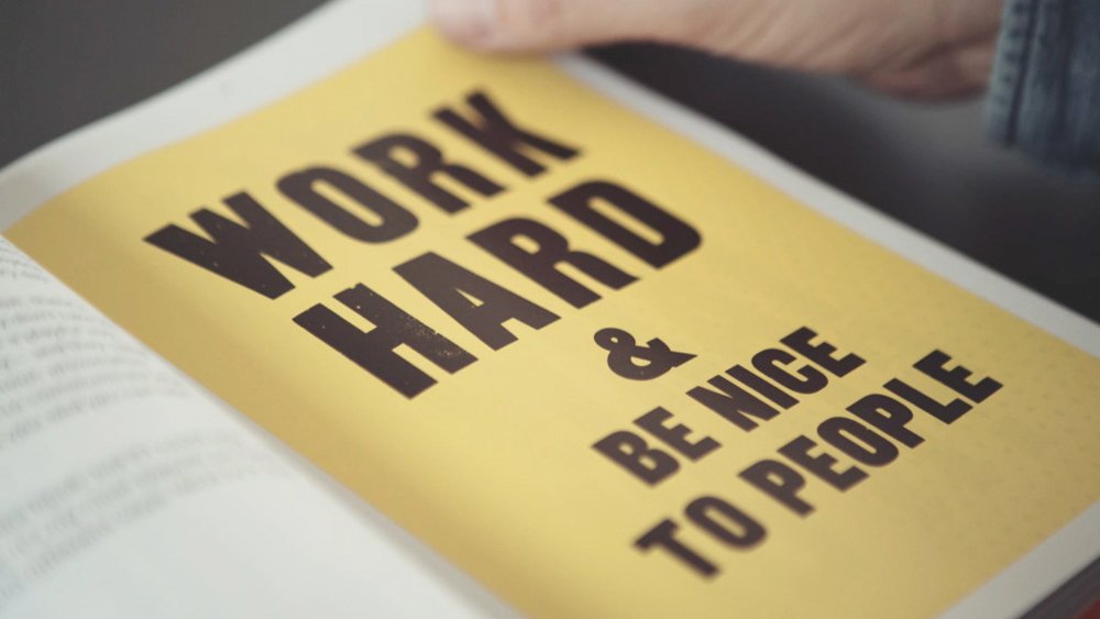
Having grown up in the pre-digital era, Anthony always worked with traditional techniques, cutting, stripping, pasting and getting his hands dirty. Printed in letterpress, his typographic posters hint at the Bauhaus aesthetic that inspires his work. His iconic Work Hard And Be Nice To People poster was imagined when he was waiting in a queue at a supermarket and heard a lady offering advice to a passerby. In a world full of visuals relentlessly vying for your attention, his no-nonsense phrases stay with you long after the first glimpse. Works like I Like It What Is It?; I Want What You Want, You Want What I Want are powerful, effective and a subtle nod to the sentiment of our times.
The legendary print-maker and graphic artist talks about childhood trips with his grandfather, his fierce slogans and the importance of keeping it simple.
Where does your interest in graphic design and typography stem from?
From a very early age, I was interested in visual culture. I travelled with my grandfather, and the foreign trips we took helped inform my love of culture and art. Seeing the contrasts in how people in different countries use visual communication was something that fascinated me. I wanted to learn more about visual language and the power that it has to communicate ideas. That’s when I decided to go to art school to study and eventually, made art my career.
Growing up, who or what were the early influences on your practice?
I drew on a broad range of influences growing up, from pop art to record sleeve design to photography. I have an enormous appetite for new discoveries. I like to seek out new inspiration, try out different techniques and experiment with different forms of creativity.
Your posters show a measured use of type, colour and shapes. Was minimalism always a core aspect of your design aesthetic? How did you arrive at this style?
My approach has developed over time, it has been a process of exploration and experimentation. As my understanding of visual communication developed, I began to produce simpler work, reducing visual information to its essentials and eliminating unnecessary details that don't help communicate the message. My aim is to say the most with the least. My design practice reflects my approach to life - cut back on the superfluous, go back to the basics and look for deeper meanings.
Slogans and phrases lie at the crux of your craft. How do you choose the right words?
I try to avoid cliches and well worn phrases. My aim is to communicate with wit and invention. Everything I do is grounded in a particular discovery or insight.
I spend time reflecting on the message I want to communicate and consider how to best say it with wit to engage the viewer. It can be very difficult to say what you want to say; sometimes the solution comes very quickly and other times it takes longer. I don’t have a formula or a regular way of doing things; I try to avoid easy solutions and push myself to develop new ways of thinking and working.
Having studied in the pre-digital era, how was it making the transition from analog to digital?
I feel lucky that I grew up and studied during the pre-digital era. I can’t imagine it any other way. I can see the benefits of both analog and digital. I like the craft and skill required to make physical work, but also appreciate the ease and immediacy in how we can connect with each other through digital means. We should use the best of both and combine them in new and thought-provoking ways.
What is your favourite part of the creative process?
Reaching a successful solution to a tricky problem.
What are you currently exploring through your work?
Like any other creative person, I am constantly searching for new inspiration and exciting ways of making work. It’s something I’ve always done. I like to disrupt my own approach and question how and why I do things, so this year is no different.
This article was originally published on Design Fabric.

