Behind the Scenes of The House, Netflix’s New Ode to Stop-Motion Animation
The anthology reveals the enduring charm and challenges of the medium
A still image from the new stop motion animated Netflix series The House. | Image courtesy of Netflix
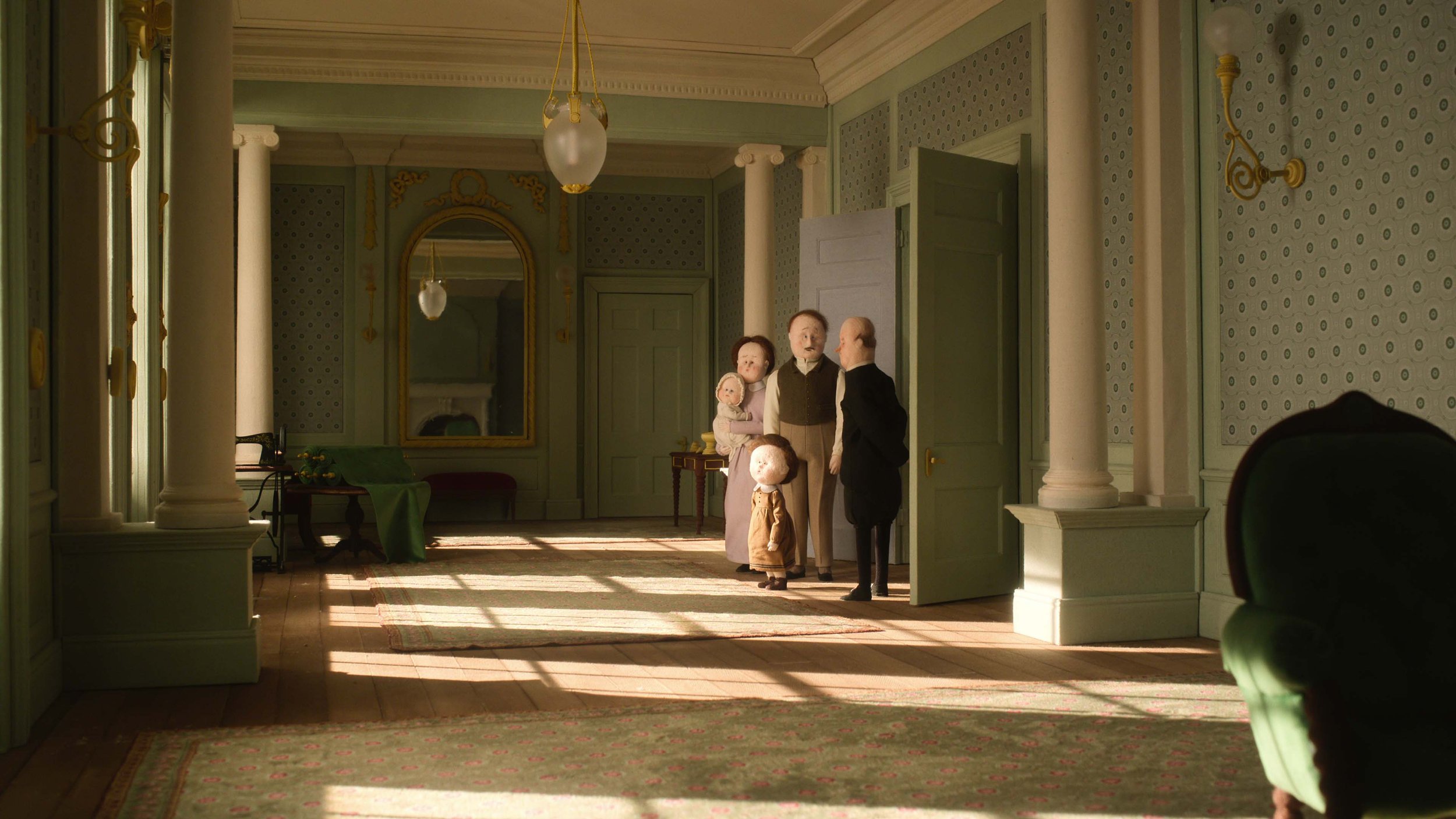
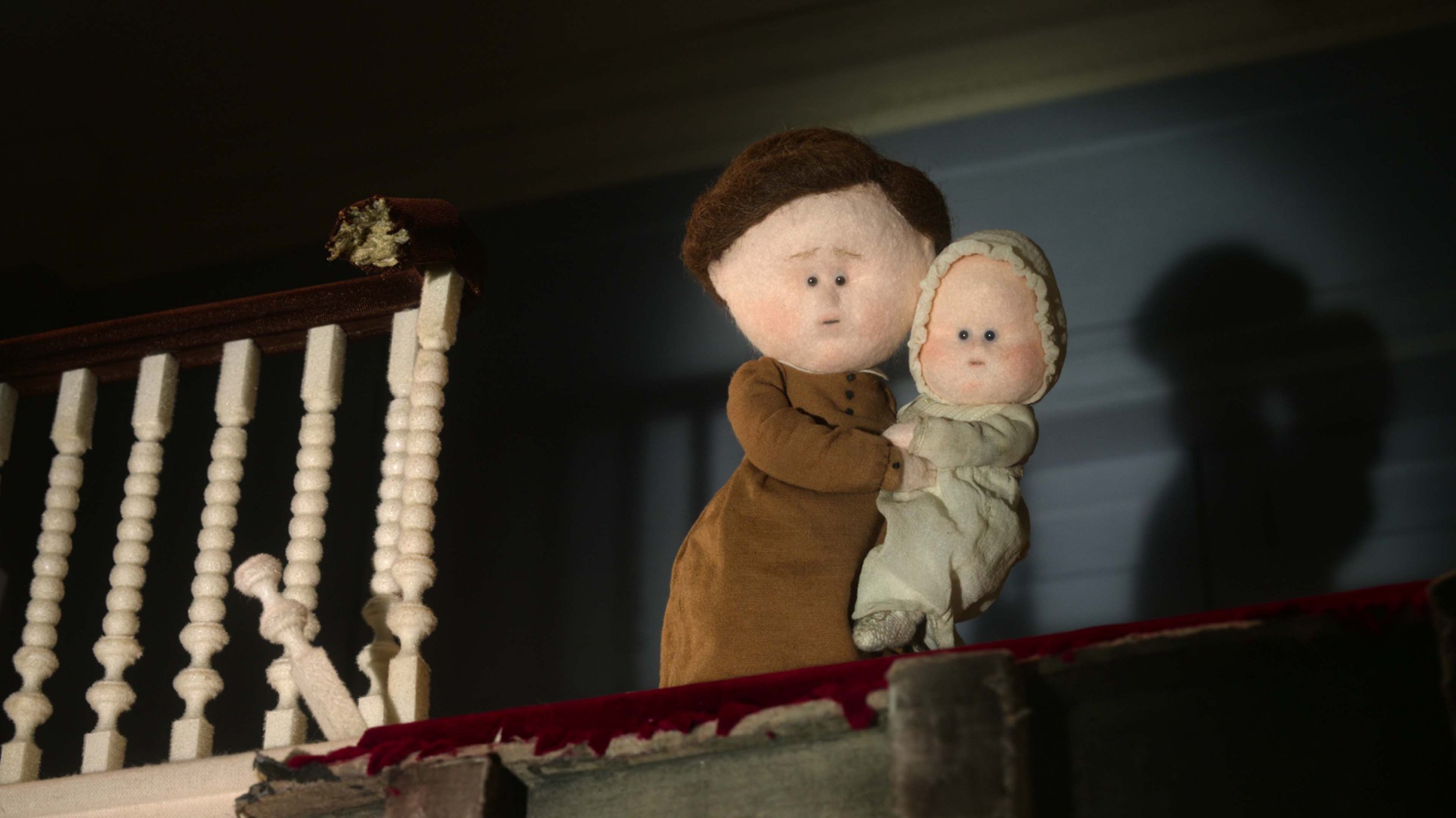
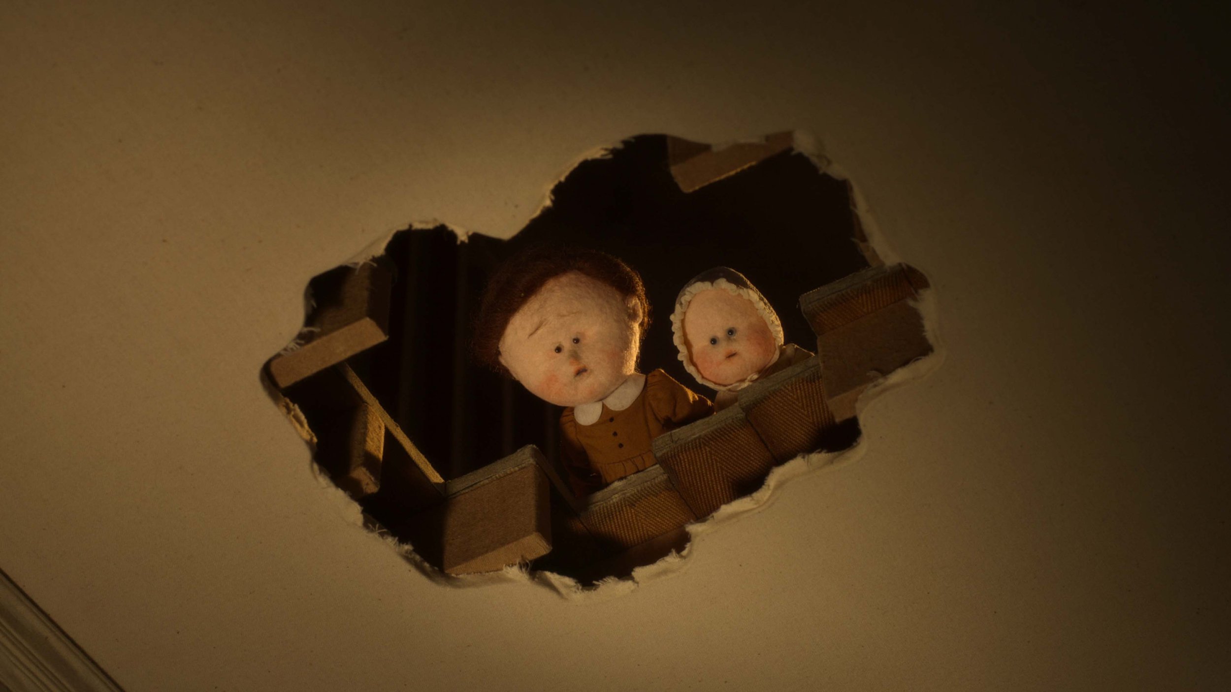
In a scene from Netflix’s new stop-motion anthology The House, a little girl called Mabel walks down the hallway in a Georgian mansion as the dusk rose carpet that lines the passage gently quivers under her feet. The anthology, divided into three chapters laced with deep-rooted elements of psychological horror, is full of such delicate, delicious details. It is a testament to the herculean demands, challenges, and, ultimately, the triumph of stop-motion animation.
Produced by Nexus Studios, The House is a dark comedy that traces the story of a mansion and the people who inhabit it across three timelines. The chapters, simply named “I,” “II,” and “III,” are directed by leading figures in independent stop-motion animation. Emma de Swaef and Marc James Roels kick off the origin story based in the 1800s that follows a growing family and how they come to live in the house. Niki Lindroth von Bahr brings the narrative to the present day, where a contractor is desperately trying to flip the house, while Paloma Baeza pulls the audience into a dystopian future where the house is the only surviving building in a landscape submerged in a global flood.
The idea for the overarching story was sparked during a meeting in 2019, when Nexus Studios’ co-founder and series producer, Charlotte Bavasso, invited the four directors to lunch to discuss a collaborative project. One of the first things the directors arrived at was the plot, which would unfurl a generational story through the lens of a house. Only then did the three-story mansion that became the centerpiece of the anthology begin to take shape. “In animation you’re creating everything from nothing, so our production designer Alexandra Walker was crucial in designing the overall look of The House. We all worked together to conceive the architecture so we felt happy with a home that could ‘house’ each of our different stories,” says Baeza.
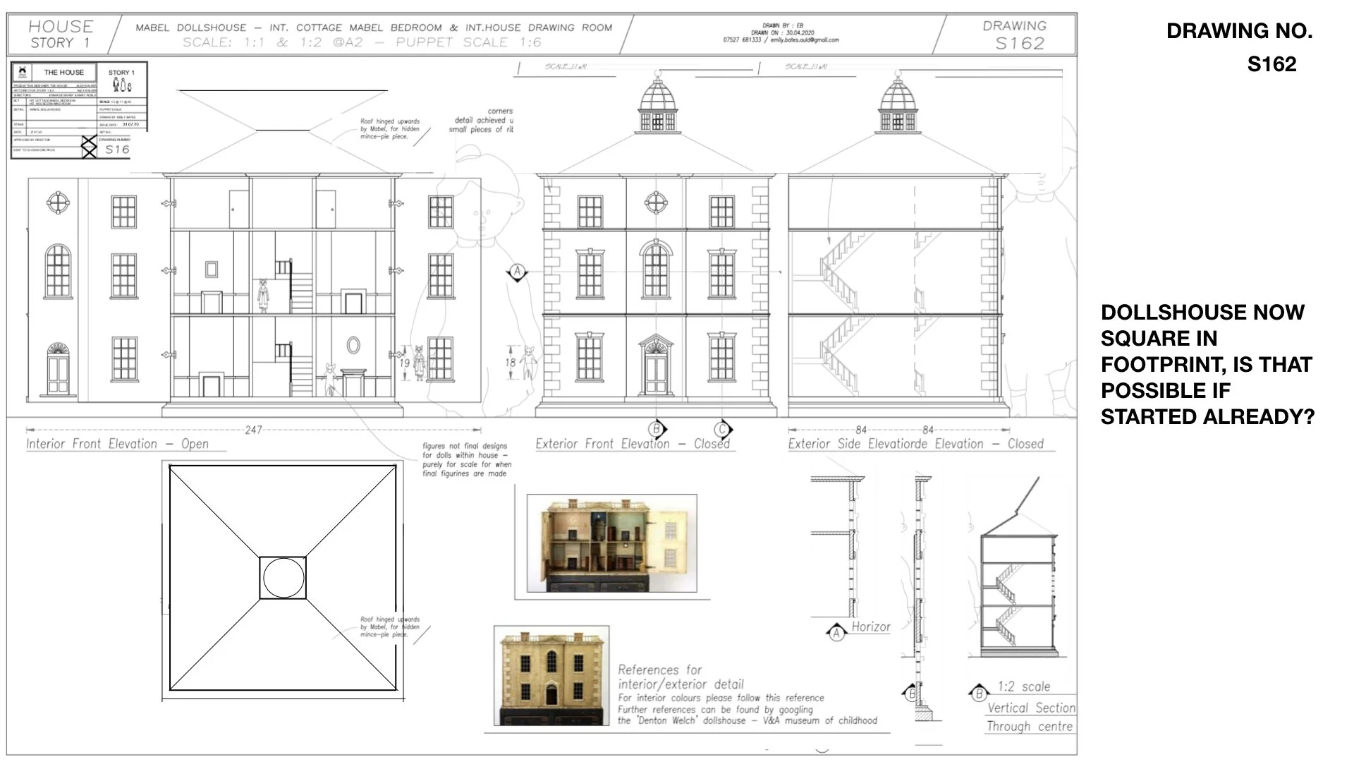
When we get our first glimpse of the mansion, it stands on a hilltop, amidst acres of lush green fields. The base structure of the imposing house—with its crackling fireplace, sweeping hallways and upholstered furniture—was made of wood, which was then wrapped in elements handcrafted in felt, fabric, and wool. The tactile, fuzzy texture of the materials used to make the puppets and the sets lends the first chapter much of its visual character.
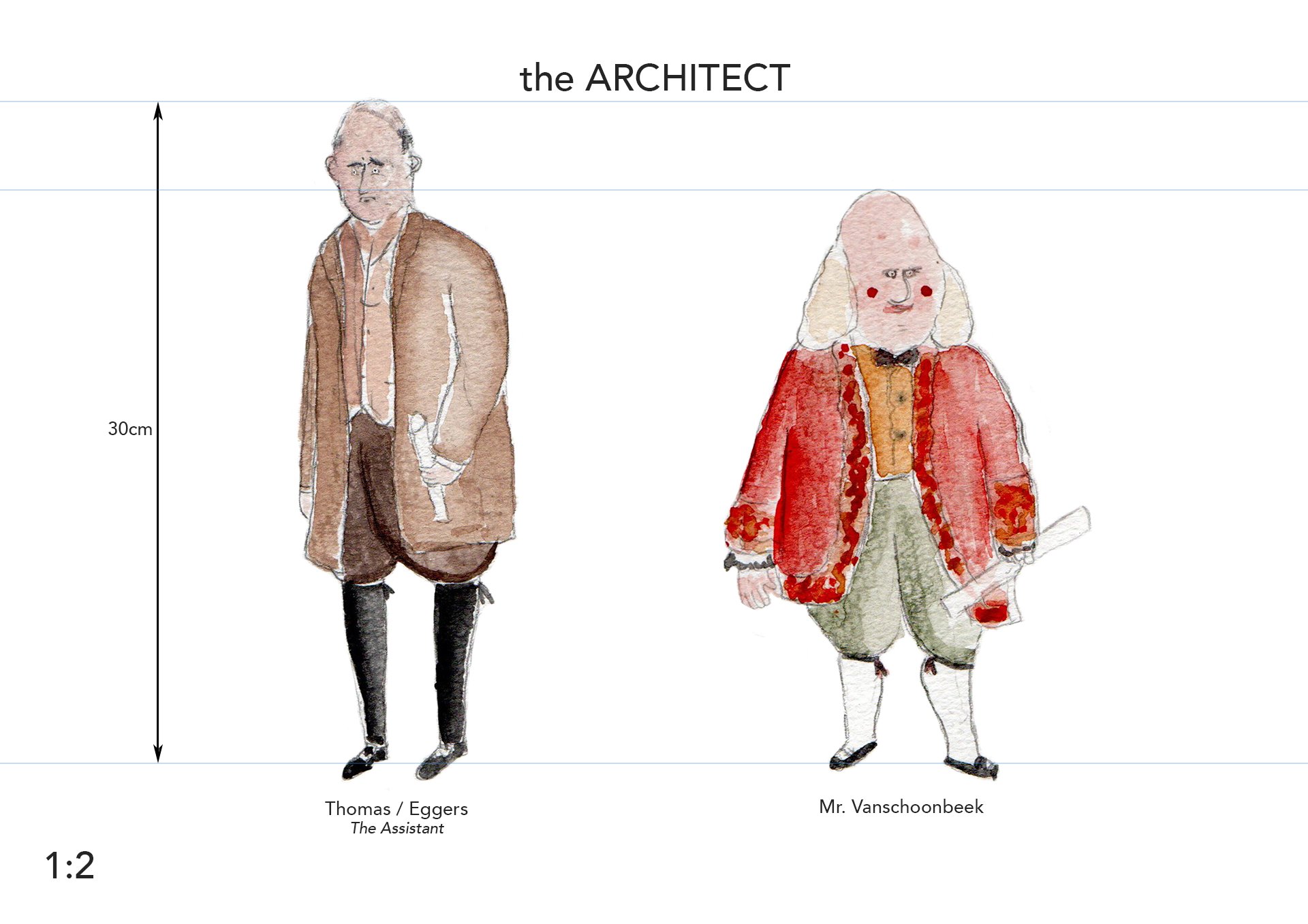
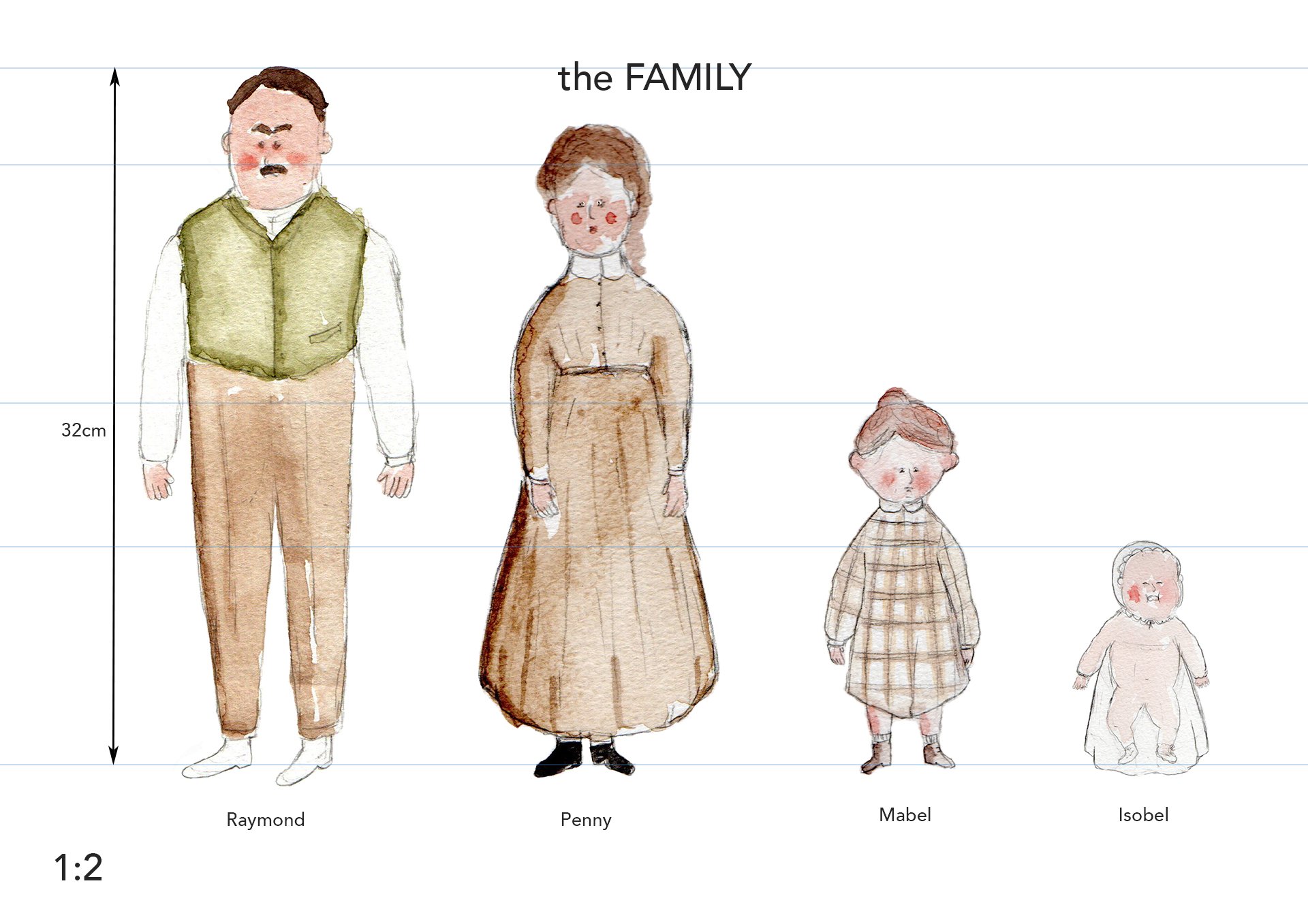
This meticulously crafted house becomes the new home of an impoverished family of four in the 1800s, when the father, Raymond, strikes a strange deal with an eccentric architect who offers to build them a stately house, but not without an ask: The family must never return to their quaint rural cottage. The mansion is a strange but luxurious place: Meals appear out of thin air, cooked by unseen hands, and lamps are lit automatically, as the last light of the day leaks from the sky. At times, it is so easy to forget that everything in this world is built from wool and fabric, a stylistic signature that Swaef and Roels use throughout their stop-motion animation projects.
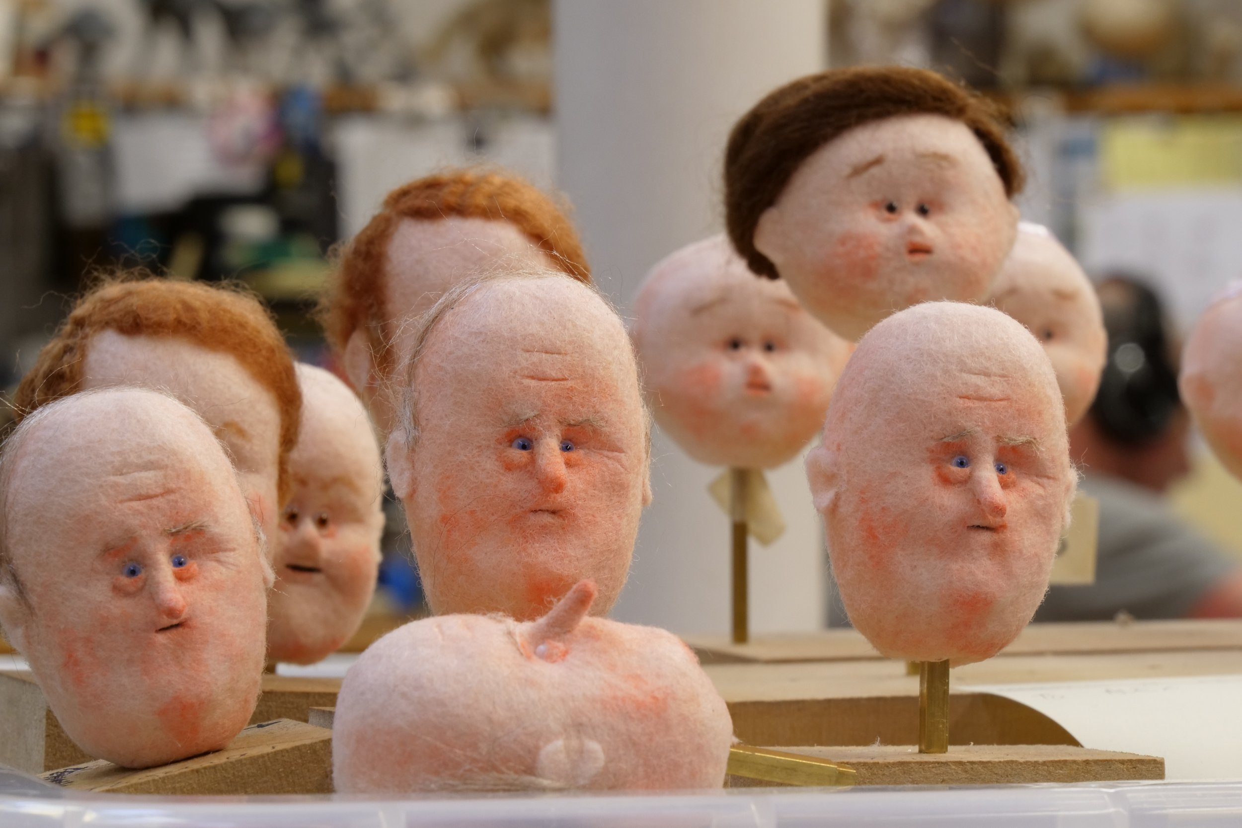
The duo, known for their critically acclaimed short This Magnificent Cake, and their bulbous-headed needle felt puppets that they build themselves, did a lot of historical research for costume and architectural references. While the puppets for The House were crafted by Mackinnon & Saunders, the characters for the first story retained the aesthetic of the ones Swaef made for previous projects—beady eyes set in big, fuzzy heads, that look like they have been washed by a light drizzle. As the story becomes increasingly bizarre, the odd proportions of the puppets add to the dark notes of the gothic storytelling.
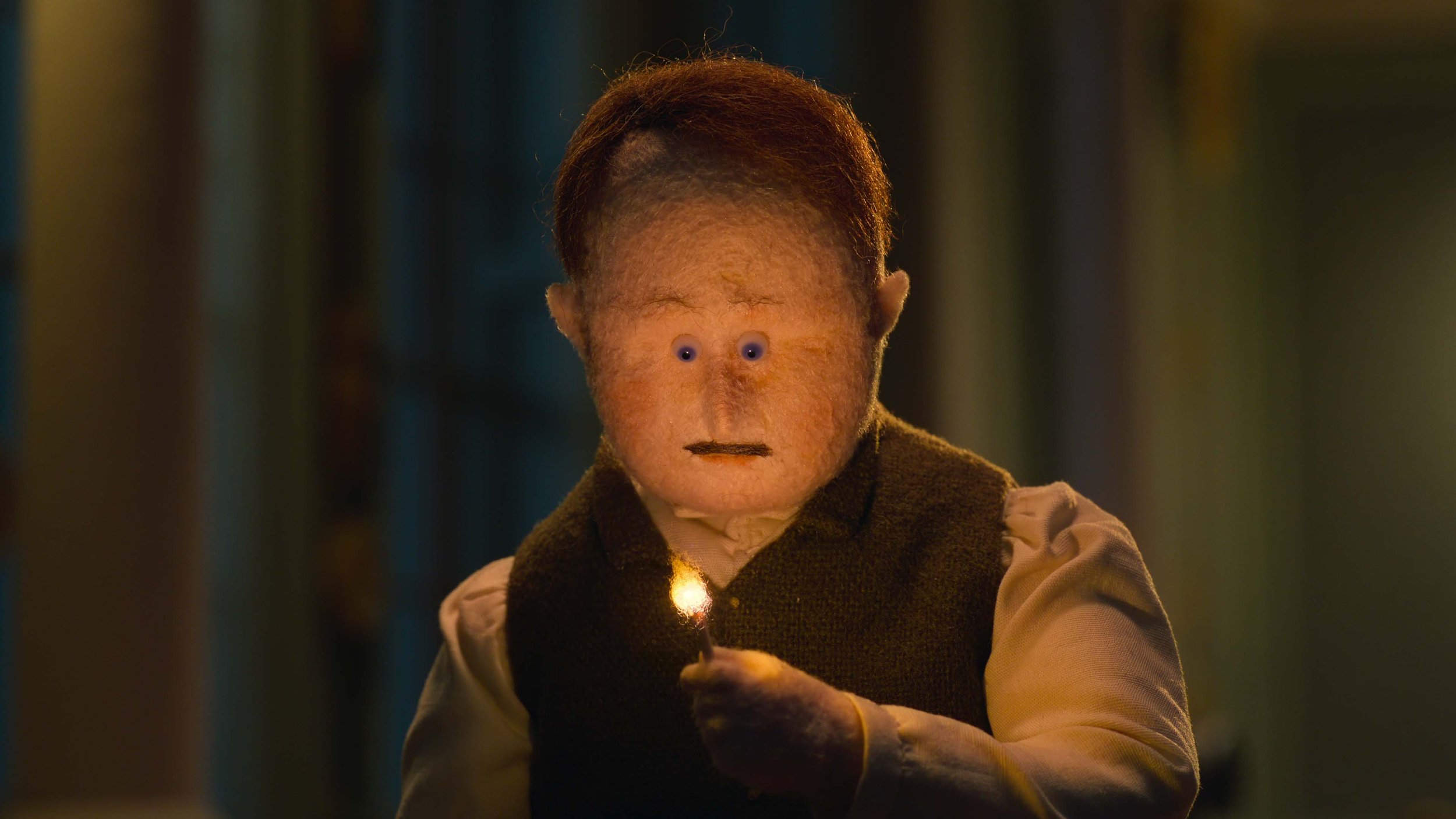
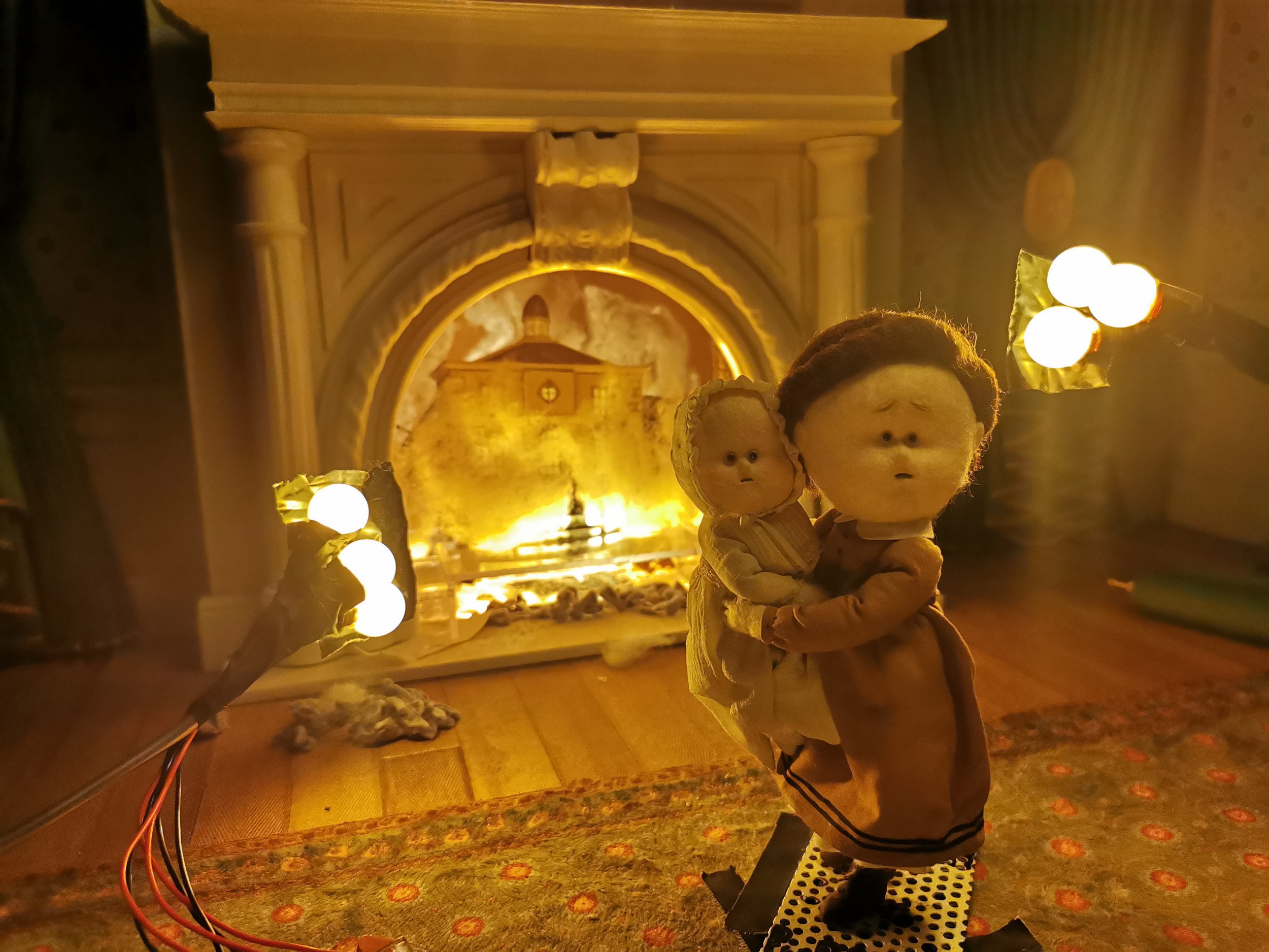
Fire, one of the most notorious things to animate in stop-motion, along with elements like mist, rain, and fog, played a crucial role in a few telling scenes from the first chapter, while the animation underscored the shifting tonality of the story: The slow, quivering flames when Raymond lights a log in the fireplace for the first time were softer than the wild, roaring fire that later consumes Mabel’s favorite dollhouse. “The fire effects were a real collaboration between our animation director Tobias Fouracre, cinematographer Malcolm Hadley, and us,” says Swaef. “We knew we wanted to do the effects on set; Tobias developed an animation system for the flames, and Malcolm programmed lightbulbs to create a flicker effect.” While the story slips from reality and nosedives into a fever dream, the level of detail that went into the world-building grounds the anthology and makes it instantly believable.
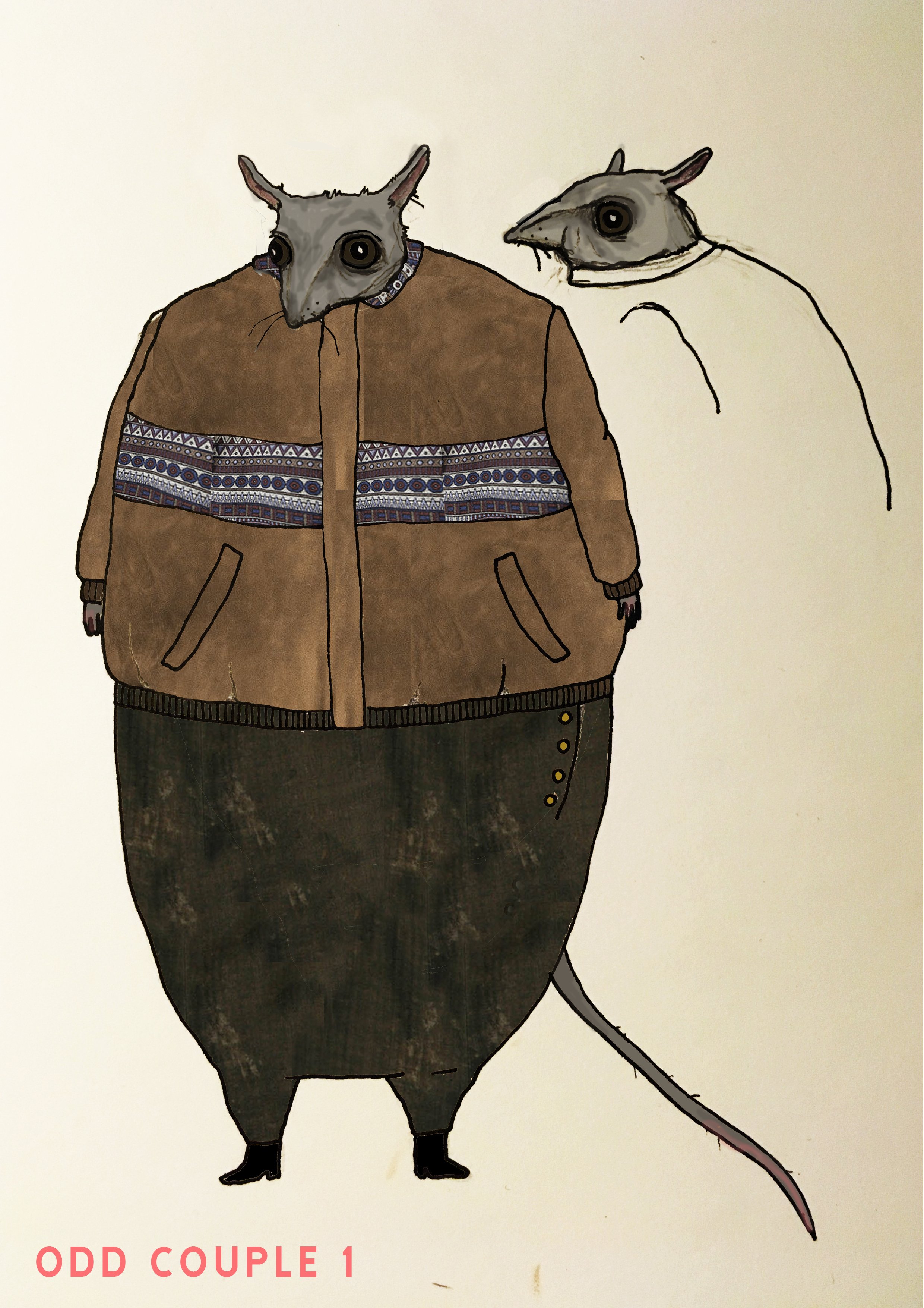
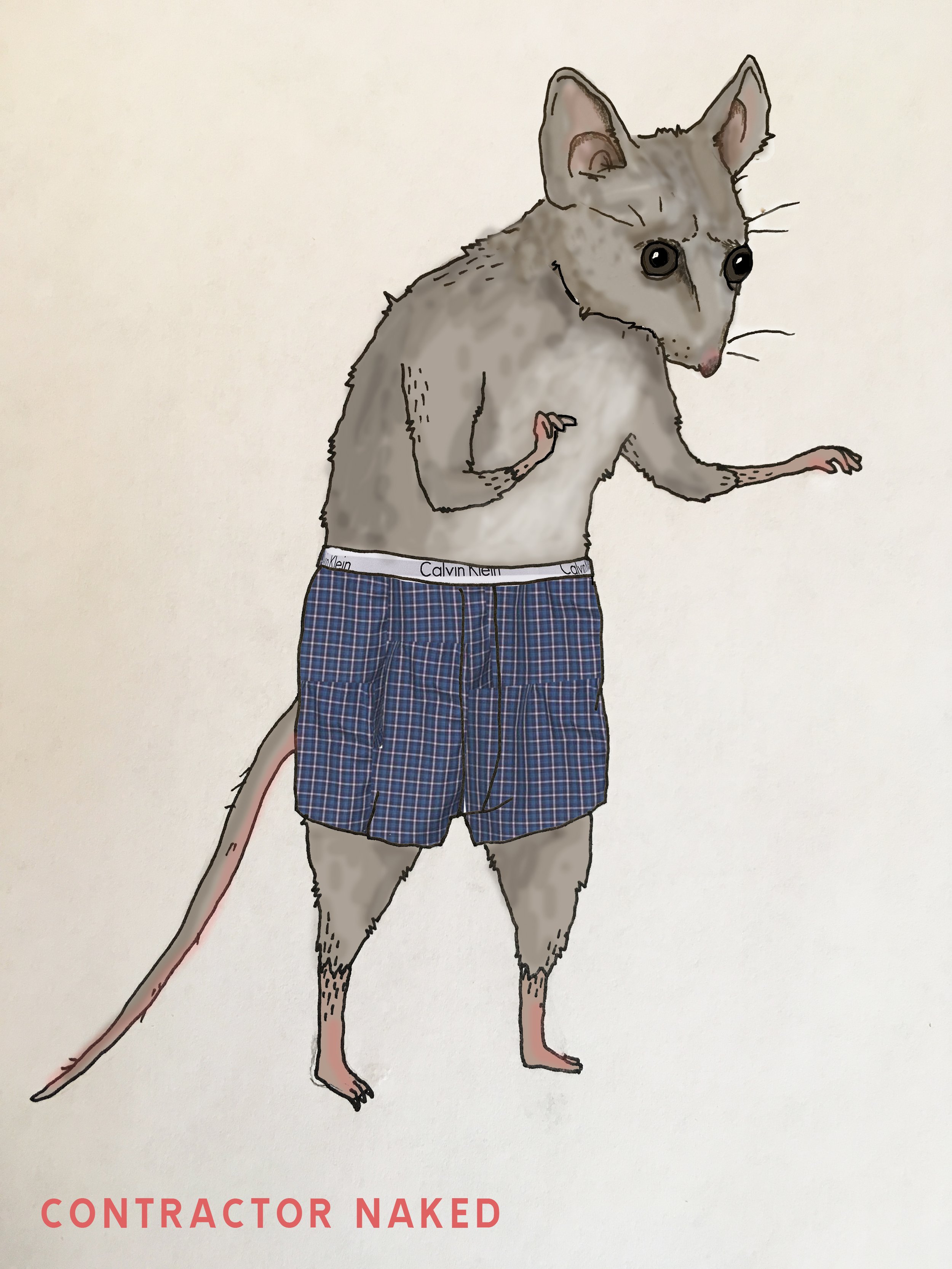
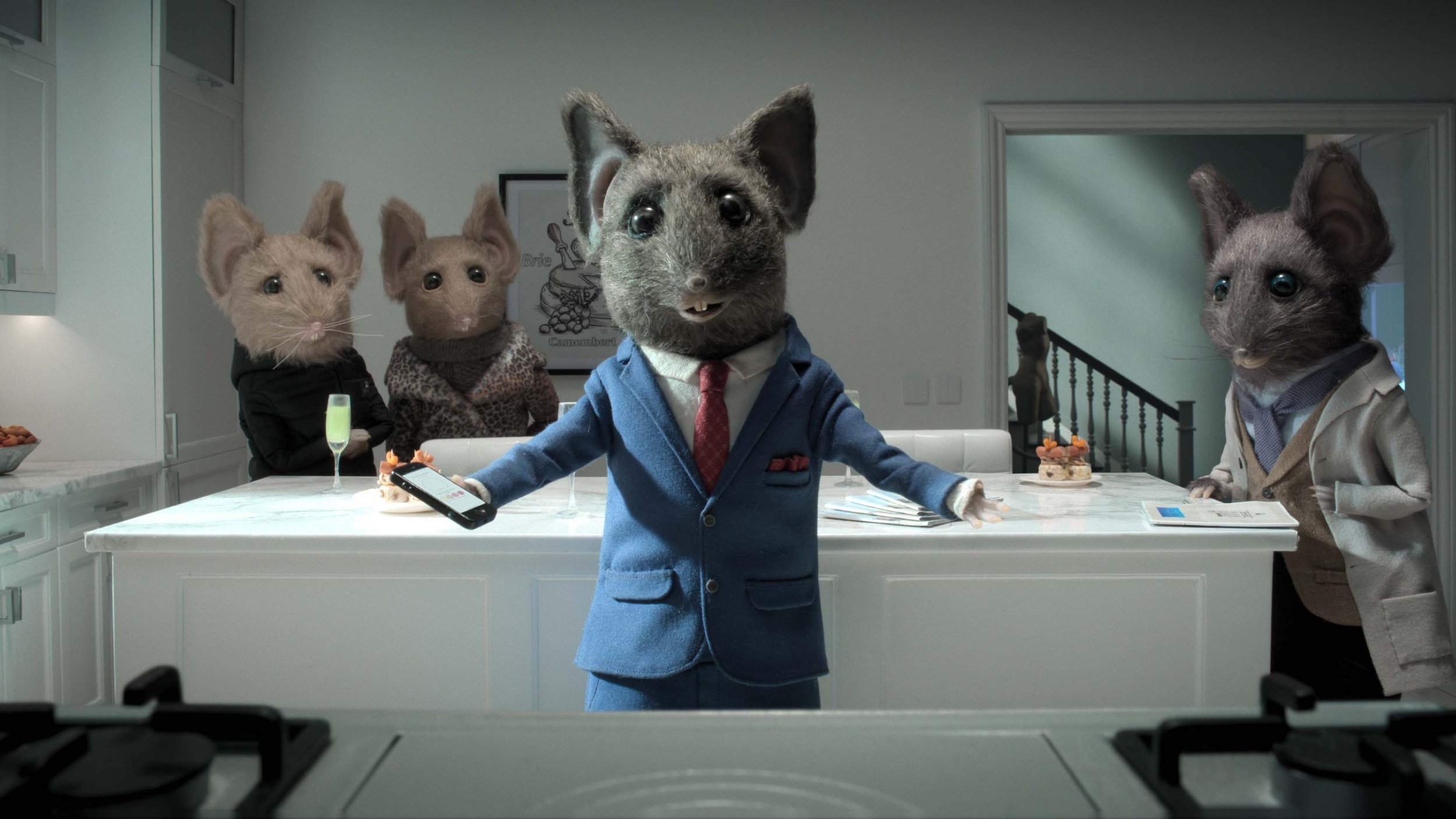
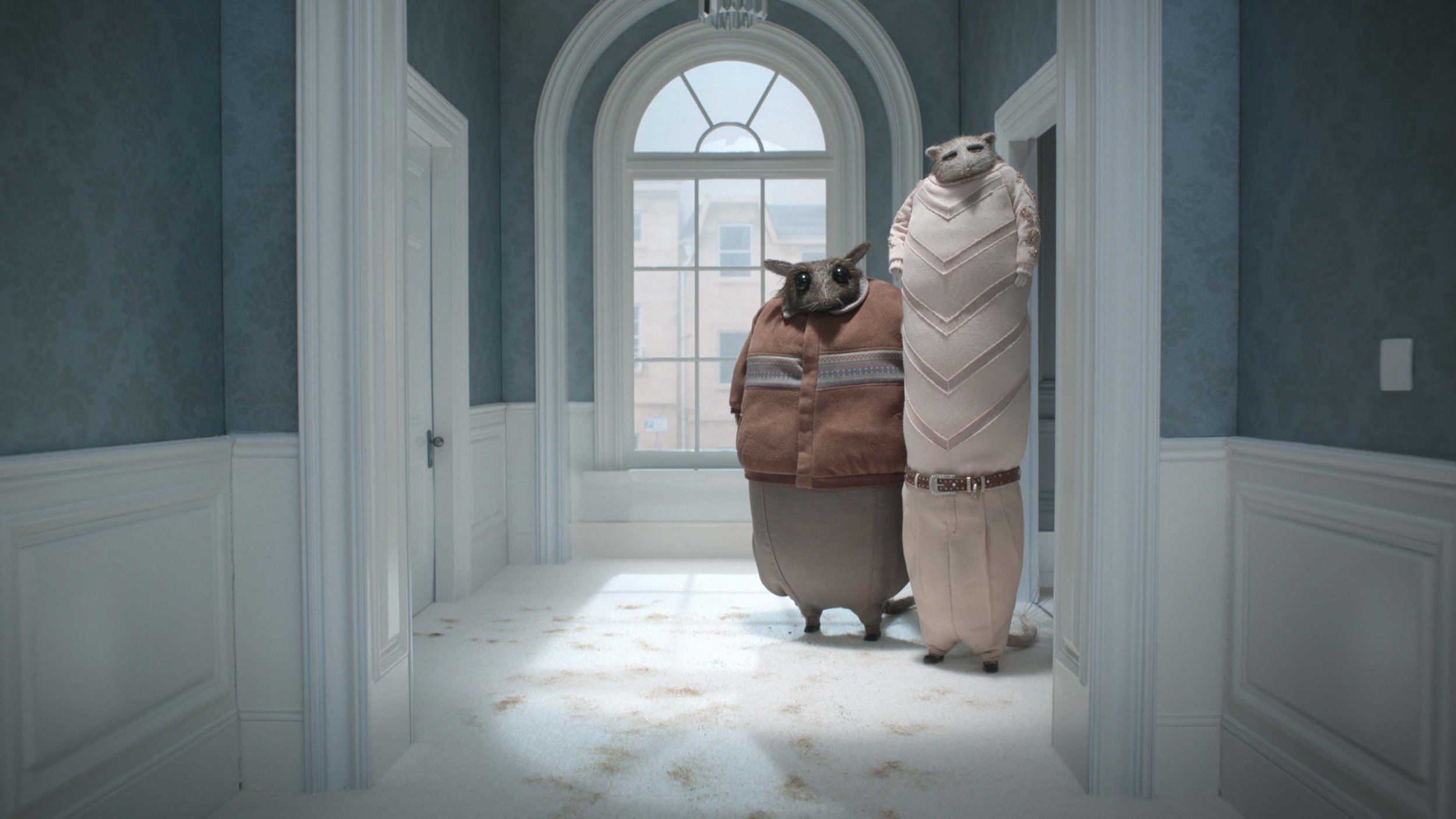
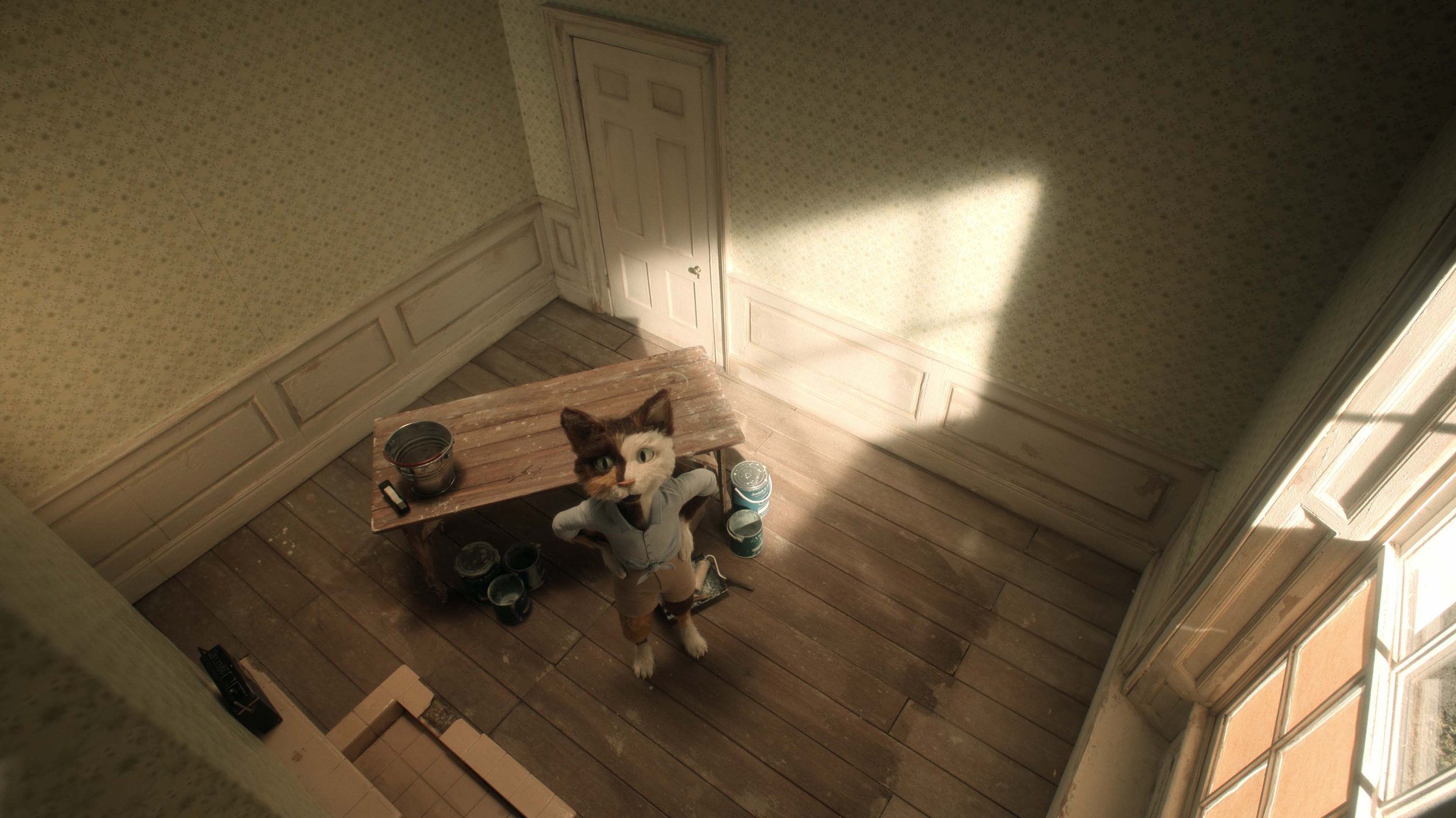
The house itself transforms dramatically in the second chapter. Gone is the hilltop. Instead, it now stands in a busy crossroad in the present day. We meet a contractor, an anthropomorphic rat who desperately tries to sell off the house he’s just refurbished, only to be stuck with an incessant fur beetle infestation and a strange couple from an open house who refuse to leave. “I wanted to make an eerie and absurd thriller with this current overheated real estate market as a backdrop, inspired by David Lynch and freaky isolated apartment stories like The Tennant and Repulsion,” says Bahr, who is known for her award-winning short films like Bath House, The Burden and Something to Remember. “It’s about madness that comes from within but also takes place in a society that’s quite mad itself, where our most basic need for a roof over our heads has become connected with social and material wealth, a class marker.”
Along with art director Nicklass Nilson, Bahr transformed the interiors of the house to fit a soulless, Pinterest-approved aesthetic, replete with a kitchen island wrapped in imported Carrara marble, Scandinavian-style wood cabinets, and phone-integrated mood lighting. “I wanted the interiors to reflect a modern, lavish style but at the same time look cheap and a bit desperate,” she says. “Nicklas and I did a lot of painful research on MTV Cribs and Keeping Up With the Kardashians.”
As the story moves on from the somber notes of the first chapter’s gothic underpinnings, Bahr’s artistic vision creates a contemporary, yet oppressive setting. The protagonist’s desperation and the dry humor that punctuates the story reveals itself in the finer details: the bleak white light in the contractor’s basement office that heightens a dreary mood, or the “sexy” golden mouse statue in the hallway that makes for an absurd accent piece. “I’m glad that the first two stories differ so much in tonality and artistic style even though we are playing with similar elements of humor, absurdity, and horror,” notes Bahr. “Marc and Emma’s story is darkly beautiful and mine is a bit more crude, using depressing contemporary details to create an unpleasant atmosphere.”
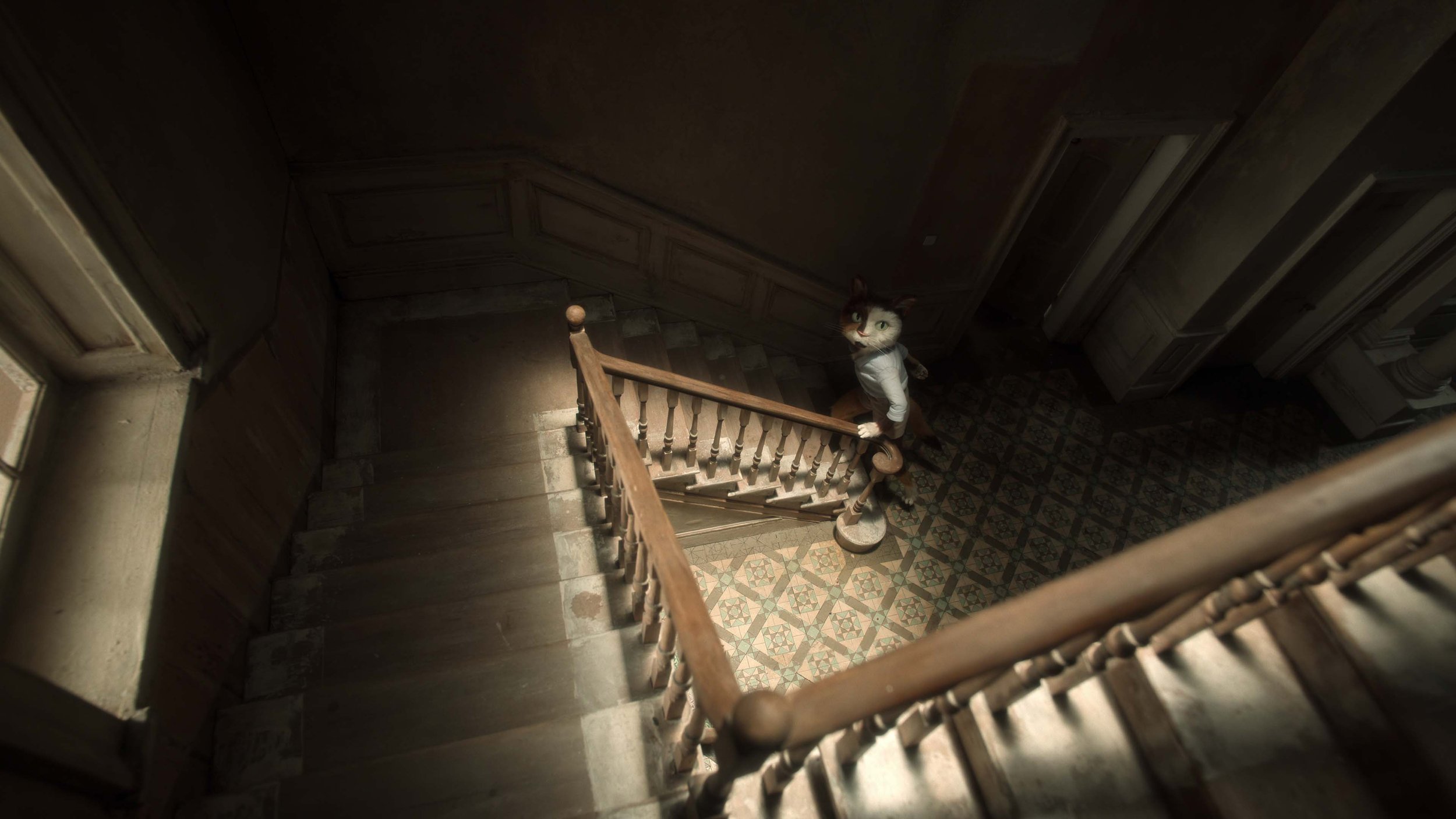
As much of the preproduction happened during the COVID-19 lockdown, visual details of the sets and puppets had to be communicated through sketches, drawings, and Zoom meetings. Even through the challenges of a raging pandemic, the team ensured that some elements of the house remained the same through the three chapters, like the entrance hall and the staircase that’s still recognizable, even though the house around it has changed.
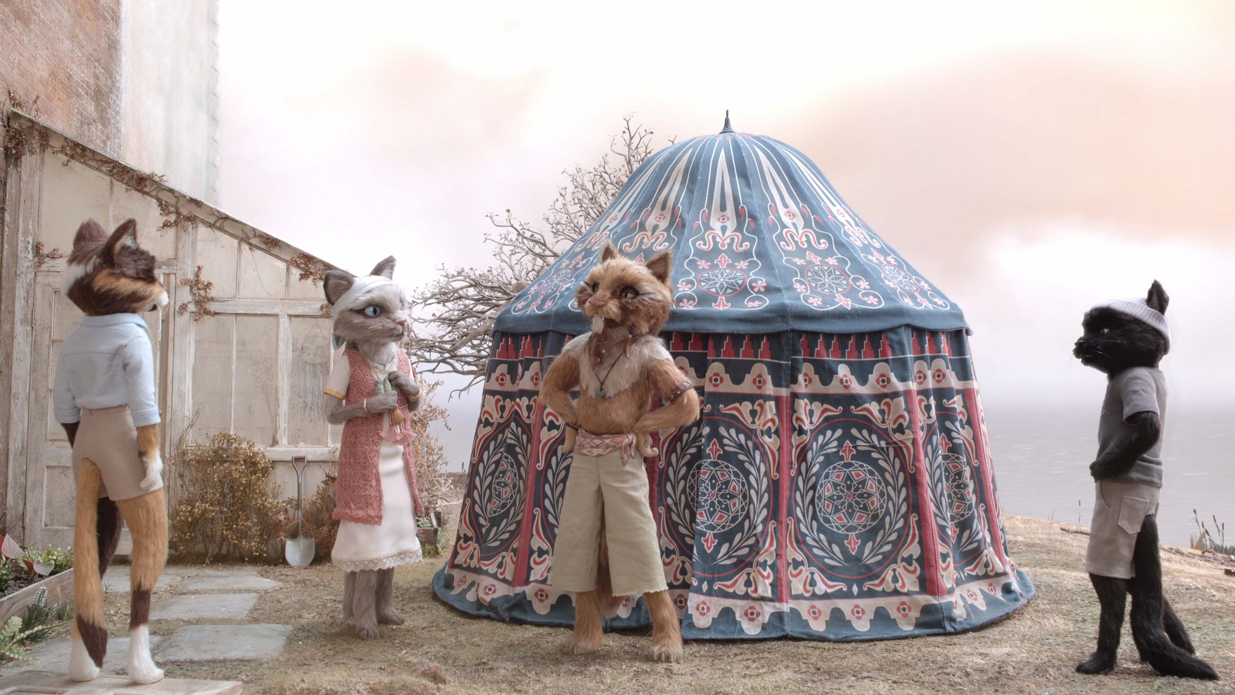
In the third story, the house has crumbled and is engulfed in an apocalyptic landscape; rising water levels flood the surrounding area, but the landlady Rosa, an anthropomorphic cat, is determined to save the mansion. “In my story, we had to make layers of paint and textures, a sense of wear and history which involved a phenomenal team of painters and model makers,” says Baeza, who created equally atmospheric sets for her BAFTA-winning short film Poles Apart. “To then do justice to those sets, my cinematographer James Lewis did beautiful work with soft light and filters to capture a striking dreamlike atmosphere.” The oppressive, and at times claustrophobic, storytelling from the first two chapters lightens in the third, as Lewis fills the screen with a rose-tinted light haze.
The tactility of the textures seen in the series—the murky water from the tap, the gloopy wallpaper glue that Rosa mixes, and the peeling, daisy-print wallpapers in the rooms—allude to the creative wizardry that lies at the heart of stop-motion animation. Each element is lovingly handcrafted and then brought to life by tireless positioning and repositioning off-screen. The eleven animators who brought The House to life often had to face mini challenges to get the work done. “In the third chapter, the size of the puppets meant that some of our sets were pretty big,” reveals Baeza. “This led to some interesting access issues for the animators, who were often reaching through small door openings or climbing ladders to reach the cats.”
It is perhaps the handcrafted charm and the sense that everything seen on screen is made from very tangible real objects that has led to the recent popularity of stop-motion animation, which is apparently having a moment. With directors like Wes Anderson returning to the medium in Isle of Dogs, short films like Robin Robin finding a home on Netflix, and the much-anticipated Pinocchio—co-directed by Guillermo del Toro—in the works, one could even argue that stop-motion, in spite of its grueling creative process, is in its golden age. So, what about the aesthetic still sticks?
“There is more stop-motion being produced now than ever before in the history of cinema,” says Fouracre, who directed the animation in The House’s first chapter. “It is the pull of a real object coming to life—one that the audience knows they could touch and is clearly inanimate, and yet they are witnessing it move and seemingly live. If done well, it’s a kind of alchemy that always resonates with viewers.” Bahr says the medium lends itself to honest mistakes and to “the vulnerability of imperfection” that tugs at heartstrings—something that almost never finds a place in the slick, hi-def world of CGI.
“It probably fits into a hunger for authenticity that is apparent in other aspects of society, too. People are more interested in things that are handpicked, imperfect, unique. There is a new appreciation for craft and skill,” says Swaef. “People want organic sourdough with a thick crust, not perfectly sliced white bread from a factory. The former might be more of an acquired taste and more challenging to make, but far more rewarding in the end.”
This article was originally published on Eye on Design.

