Karan Singh remembers how New York gave rise to his eccentric pattern-based style
In conversation with artist and designer Karan Singh about the evolution of his aesthetic as he reflects on his 10-year long career and the headlining projects along the way.
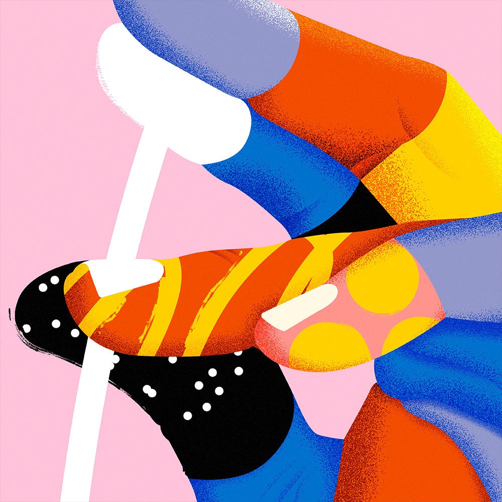
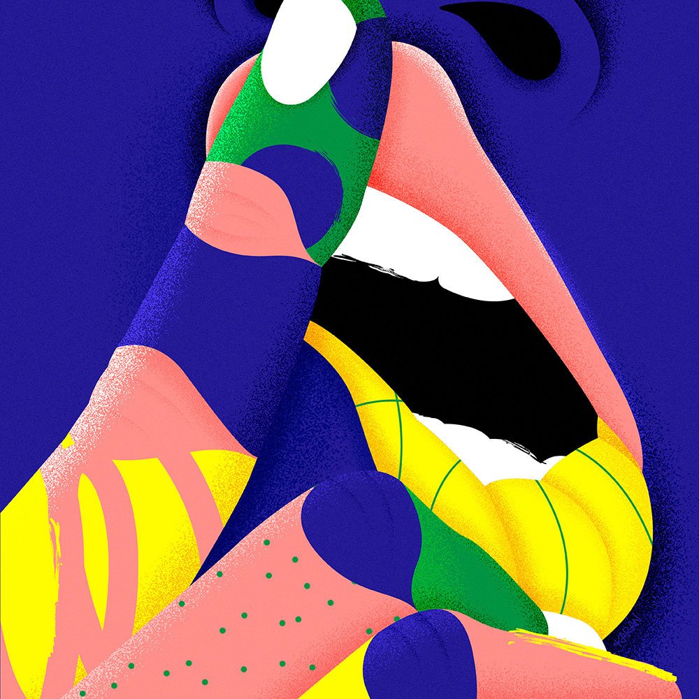
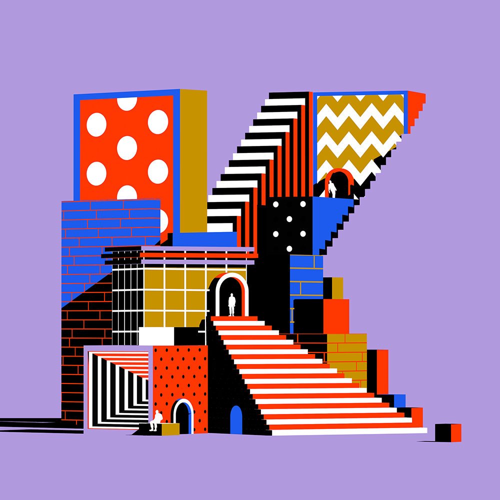
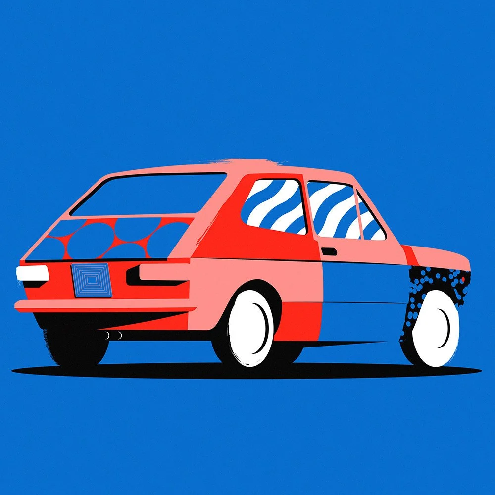
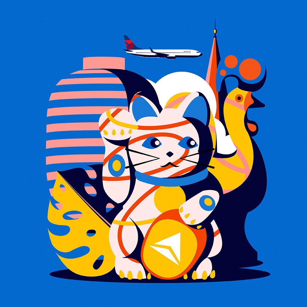
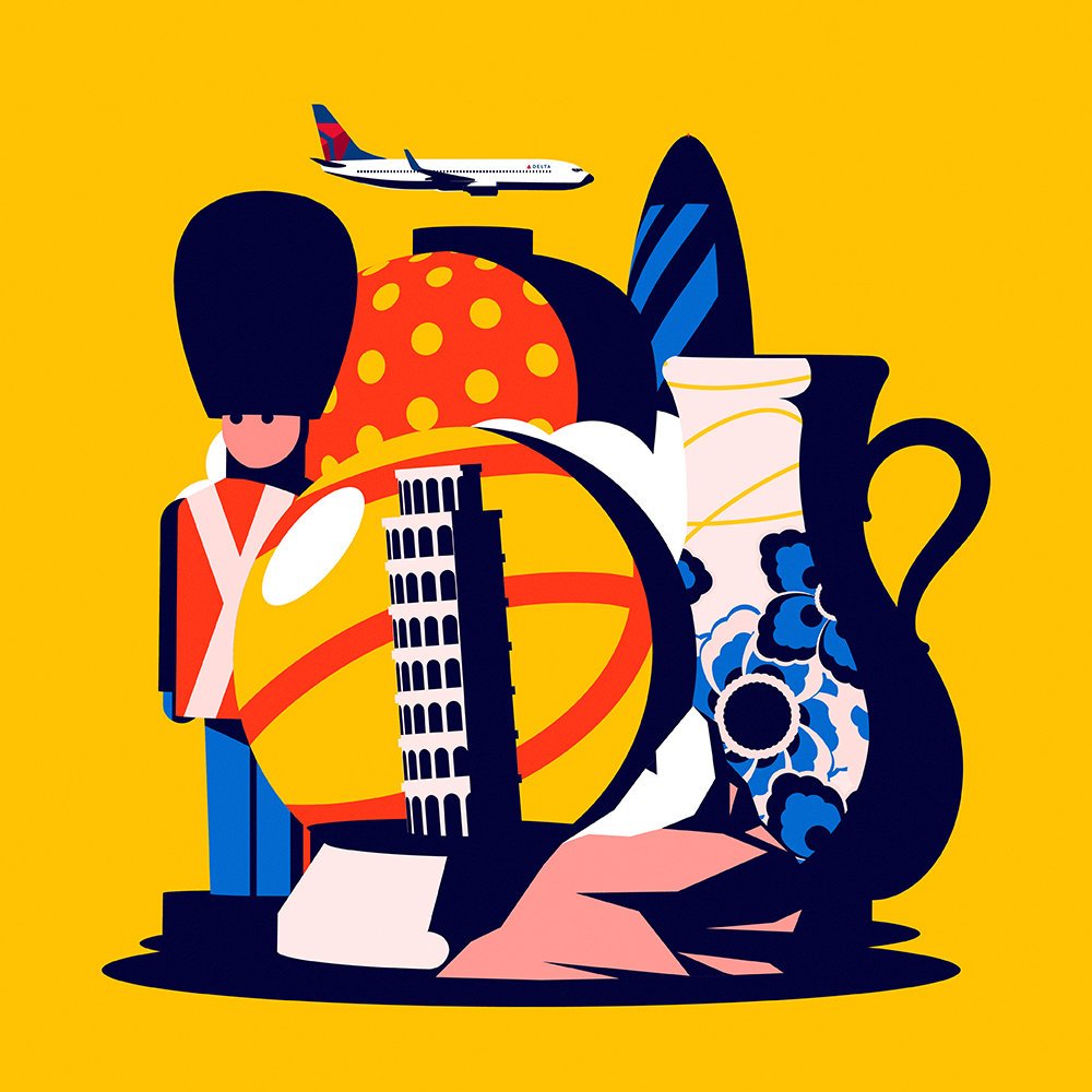
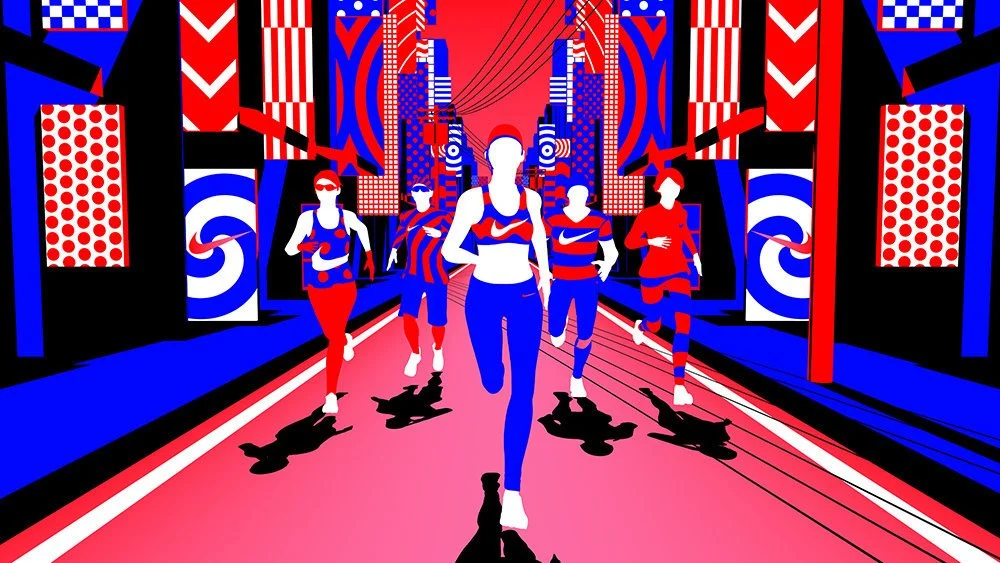
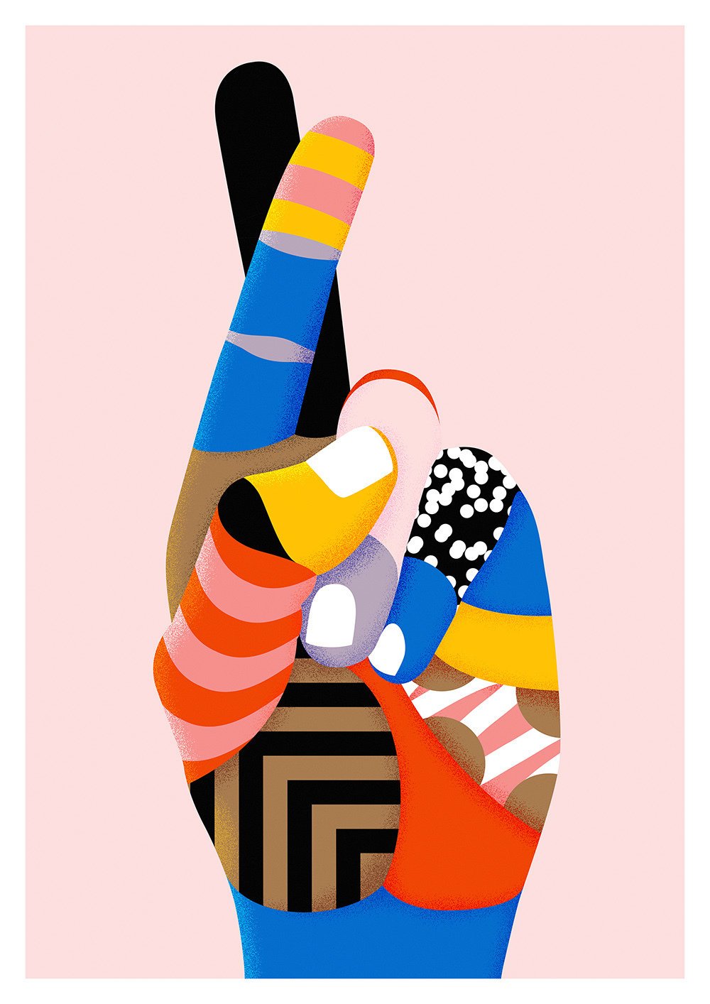
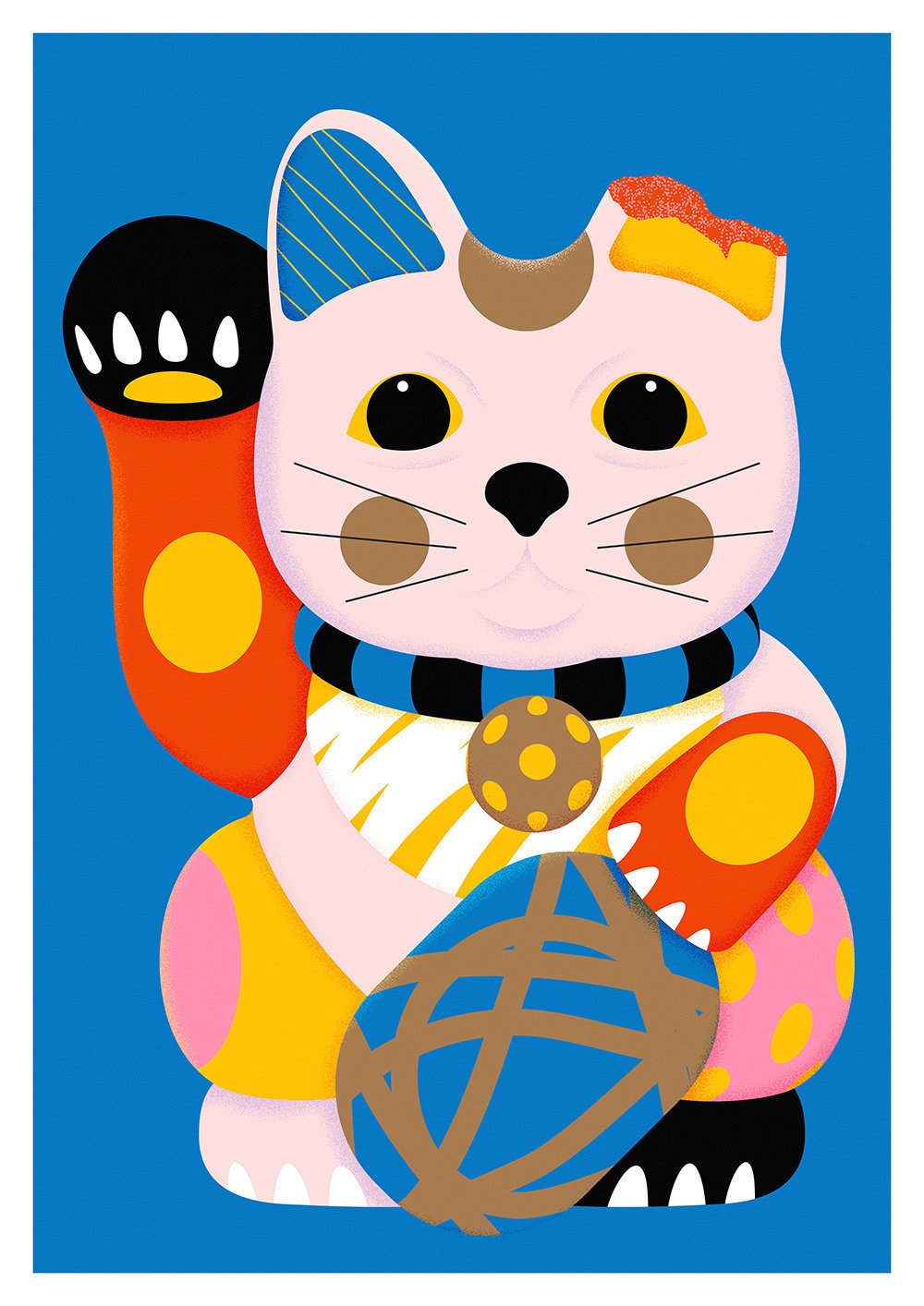
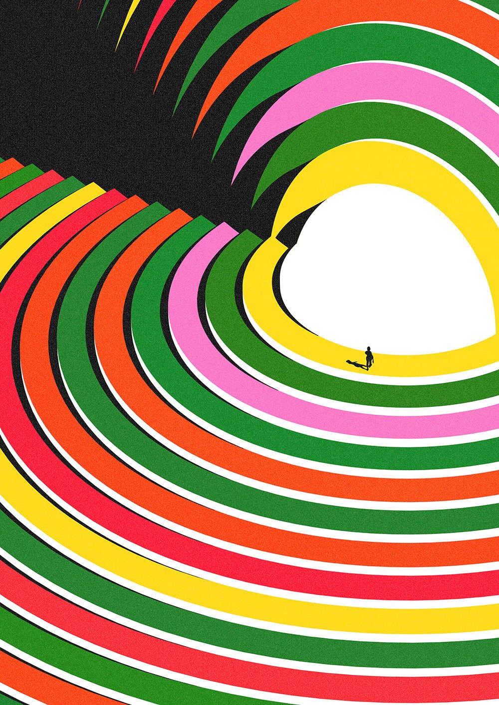
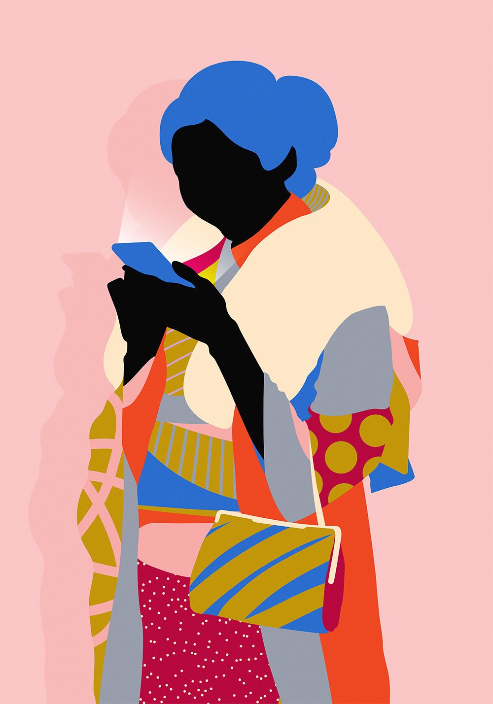
When sifting through Karan Singh’s work, it’s impossible to miss his sharp eye for colours and patterns. Born and brought up in Australia and of Indian origin, the Amsterdam-based creative dons the hats of a graphic designer, animator and illustrator with equal panache. His unique pattern-based aesthetic lends itself effortlessly to both commercial and personal projects, making his work immediately recognisable. The imaginative and meticulously created compositions focus on depth and dimension through repetition. It is the way he sculpts the volume of objects, rendering the shadows and highlights with only solid blocks of colour that underlines his genius as a designer.
Karan started building a body of work while pursuing a course in Design Computing in Sydney. It wasn’t long before he started working on editorial briefs and commercial projects, and over the course of ten years, he has collaborated with Adobe, Nike, AirBnb, IBM and Onitsuka Tiger among others.
Over an hour-long conversation, he talks to us about the highs and lows of his personal and professional life and remembers how each city he’s lived in has left a lasting impact on his style.
Your work is intrinsically digital. Do your pieces always begin on a screen?
It used to, before I had any experience or training. After working with various design agencies, I began to understand the methodology of creating an artwork, and that changed how I approached a piece. So now, every artwork begins with pencil and paper or on my IPad Pro. I find it much easier to come up with ideas when drawing on paper. One of the most important things in my work is the composition. When I sketch, I like to see how much positive and negative space the composition takes up on the page. I usually knock out 10 quick thumbnails of what the piece might look like. When you’re working with clients, the sketches become a storytelling process where you’re trying to work together collectively to address the design problem. You need to iterate the idea before diving into the computer to hash out the final piece.
Were you a geeky kid drawn to computers and technology quite early on?
I was terrible at drawing on paper and was far too impatient to learn how to draw with paints or pencils. I had much more patience when it came to learning how to use a computer. I was completely fascinated by it and that gave me a second lease on creativity. It was a hobby that slowly transformed into an obsession. The digital element has always been an important part of my work because my strongest affinity was for technology. Even now, I love the challenge of learning new technology, programmes or softwares. I find it very relaxing, almost like diving into a new book.
We got our first computer when I was eight years old. I remember scribbling on MS Paint, but I didn’t take it too seriously until high school when a friend of mine introduced me to Macromedia Flash, a program that doesn’t exist anymore. That’s when I first started experimenting with drawings and this hobby started to turn into a career.
What did some of your earliest experiments look like?
My first vivid memory was sketching Daffy Duck in school. I was so proud of myself because I thought I’d nailed it. As I grew up, prevalent trends started to seep into my work. So there was a lot of grunge effect, spray paints, spots and drips. From a broader perspective, I have always been interested in objects, arrangements, light, shadow and contrast. But it took a long time for me to find my aesthetic simply because when I started, I wanted to experiment with everything. I didn’t think I would ever have a style until I found one.
Your artworks are visual melanges of patterns that are chaotic yet organised. How important is editing in your design process? How do you find the balance and decide which elements add to or dilute the piece?
I really enjoyed simplifying things. The logic is that the more you simplify a piece, the easier it is figure it out. But it isn't! It made it more challenging because the exercise was like solving a puzzle.
The process of editing involves a lot of trial and error. I try to find that balance in my work through colour. In an artwork, the colour scheme might change three to four times, and by the fourth time, I might have gone back to what it was in the beginning. But that process of trying every possibility till you arrive at the final one is my way of editing my work. It is a very immersive process led by instinct.
Knowing when to stop is a healthy and imperative learning. One of the things I’ve started to do is putting some distance between me and my work and not chase perfection. You want the mistakes because sometimes, that is what leads to newer ideas. Having said that, the ability to draw a line under your work and say ‘That’s finished’ is really, really important.
You’ve been shuffling across continents and countries - Melbourne, Tokyo, New York and now Amsterdam. How have each of these places impacted your creative practice?
I spent different periods of my career in these cities, and the impact they have is not immediate. It plays out in my work much later. My fiance and I moved from Melbourne to New York to Tokyo and we’re now based in Amsterdam, and I find myself still processing Tokyo.
New York was energetic and frantic. There’s something infectious about the pace of life in that city. That’s where I came up with my initial style with the patterns. I sometimes wonder if that need to simplify my work was born as a reaction to the chaos that I was constantly surrounded by. Talking about my learning curve, most of my understanding of the design process happened while I was working at Vault49 in New York.
While in New York I learned from other people whereas In Tokyo, I learnt the most about myself and the kind of work I wanted to make. A lot of that reflection was because I was isolated in a completely alien city. The Japanese aesthetic is minimal; everything is intentional. I started stripping my work down to the barest essentials, and tried to mirror the minimalism that I saw everywhere.
While Japan was quite constrained as a world, Amsterdam is super liberated. The Dutch speak their mind and it’s a really refreshing space to step into. In every city, my work has reflected the culture around me. In New York, I was more like a sponge, soaking in everything. In Japan, the isolation really oozed out in my artworks. And now that I’m in Amsterdam, I’m more indulgent with my work, as are the people around me.
These repetitive patterns that you mentioned are the protagonist of your work. How do you conjure these dizzying compositions?
The reason the patterns spoke to me was because I was blown away by the impact it had on an artwork. When I began illustrating, I got very caught up in trying to create the right shadow, or highlight or achieving that sense of realism until I recognised that was not what I wanted my work to be about. Your style is a reflection of your interests, habits, strengths and ultimately, your flaws as well. That shift from realism to patterns happened because I was too impatient for the former.
Also, these patterns felt universal and timeless. It would speak to any person belonging to any culture. I was engulfed by the different possibilities of how I could interpret it. How striking can it be? How ornate could I make it? How bold, or large or fine? It came out of an initial curiosity but it was these questions that kept me coming back.
I am a very impatient person, I can’t sit still in the same spot for two minutes without anything new to engage my attention. So developing these patterns is like meditation; it’s the only thing that calms me down and keeps the obsessive-compulsive parts of my character in check.
We saw some of your work for Onitsuka Tiger in India. Tell us a little bit about the project.
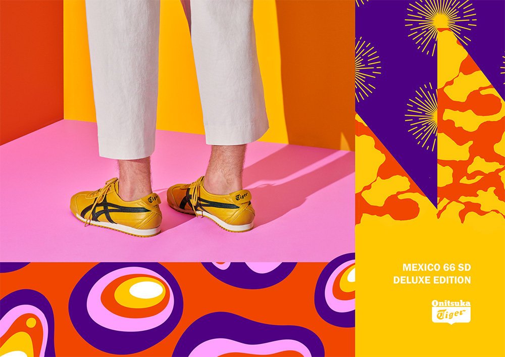
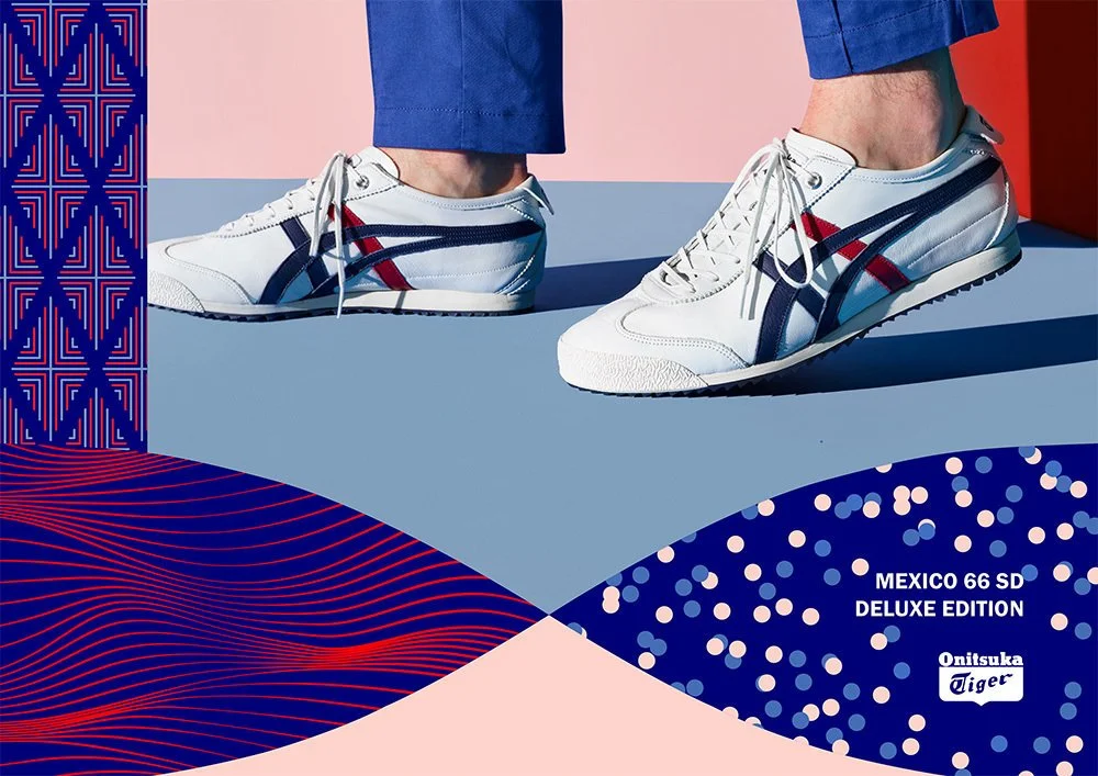
That was a super fun project that I worked on with a Berlin-based agency called The Adventures Of, for the re-release of the Mexico ‘66 sneaker. The campaign was timed around the Winter Olympics that happened earlier this year. The significance of that sneaker was that it was used as the official shoe in the Mexico ‘66 Olympics.
The brief was to create narratives for four distinct visual worlds which were represented in the ceremony. It was obviously inspired by the Olympics, but they wanted the Japanese heritage of the Onitsuka tiger to be incorporated in the identity. The conceptual framework I developed focused on four key elements rooted in Japan’s and Onitsuka’s history - Chi(earth), Sui (water), Ka(fire) & Fu(wind). I created patterns that were inspired by these individual worlds, but touched by the Japanese aesthetic. For example, the elements for water were bamboos and droplets.
The best part of that project was bringing these worlds together, and watching these patterns clash and interact with each other. What happens when you bring fire and water together? Or mix earth and wind with each other? It was one of the most challenging briefs I’ve tackled.
You’ve worked on scores of projects till date, with some of the leading brands in the world while creating personal projects and hosting exhibitions. What keeps you going?
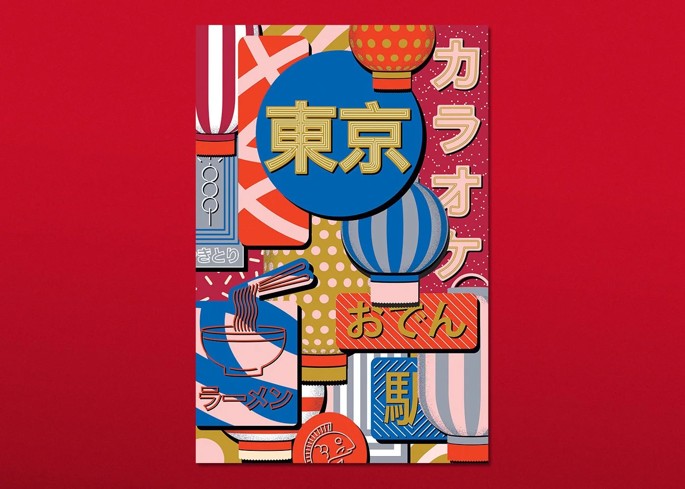
The sheer fact that I’m not creatively satisfied. I think I decided a long time back that I would probably never reach that satisfaction. Not to say that I’m ungrateful; I’m absolutely floored by the projects I’ve worked on. A personal highlight was making this poster for AirBnb about Tokyo while I was living in Tokyo. While I appreciate each of these opportunities, I think if I was creatively satisfied, I would stop iterating. That urge to keep pushing my limits and questioning what I can and cannot create is what keeps me going.
Were there any life events that impacted your work in a big way?
I’ve had some pretty defining moments in the past 10 years of my life, but the one that really shook me was being diagnosed with cancer back in 2009. In the face of a threat like that, all the trivialities of life kind of melt away. I’m in complete remission now, but that entire experience defined my perspectives both personally and professionally. It made me realise that no matter how passionately I chase my career, I have nothing until I’m in good health.
What’s keeping you busy these days?
I’m creating a lot of portraits in motion, which is super exciting because I’ve been working with static art for a while. I like to juggle between illustration, motion and 3D art and that’s keeping me on my toes. My partner and I are also planning our wedding in December, which is a project in itself. 2018 is looking promising!
